In today’s digital age, rich media is everywhere. Brands have clocked in on the fact that images, graphics, and video content tends to perform better in terms of audience engagement.
Multimedia captures our attention more than simple text, making it an excellent medium for delivering information and messaging. Design-forward thinking can greatly empower your brand, creating an aesthetic and visual appeal around it.
Not only is it essential to incorporate multimedia into your brand’s messaging, but it’s also integral to use the right kind of multimedia. This is where you’ll need to strategically go about creating just the right designs that complement your brand image and make for compelling content.
When implementing website design services, it’s an excellent idea to incorporate visuals. Visuals help establish your brand’s personality, theme, and story without you having to say much and without your user’s having to read through a ton of content. Visuals are a great way to capture the audience and reel them in to explore your website or social media more.
8 Design Tips to Make Images Look Creative
Whether you’re a beginner or have been a creator for years, these design tips are bound to help freshen up your content. As a creator, you know how challenging it is to keep content fresh and unique; use these tips to help inspire your next creative projects. Let’s begin!
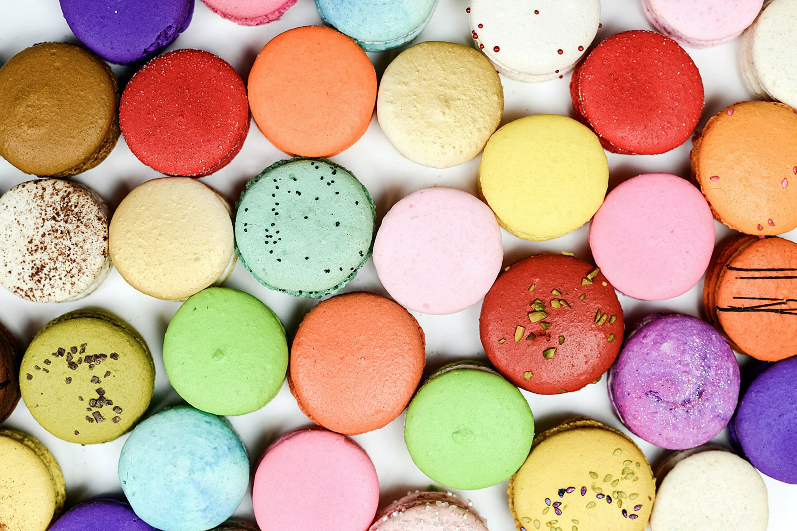
1. Colors
There have been countless studies exploring the psychology of color in consumer decisions and marketing. Specific colors help consumers and users make certain associations. For example, blue tones are typically associated with trust. Another study showed that 93% of consumers make associations based on the visual appearances of brands.
However, we wouldn’t recommend creating graphics and images that follow color psychology per se. Try to establish a personality for your designs; if you work at a Nashville web design agency and you’re making them for a brand that doesn’t have brand colors yet, go for colors that complement the brand image.
Does the brand want to look dependable or exciting? Fun or serious? Then pick colors that convey these associations to the audience. If you’re creating social media images, take a look at color theory studies and use different colors to tell different parts of the story.
2. Experiment with Lines
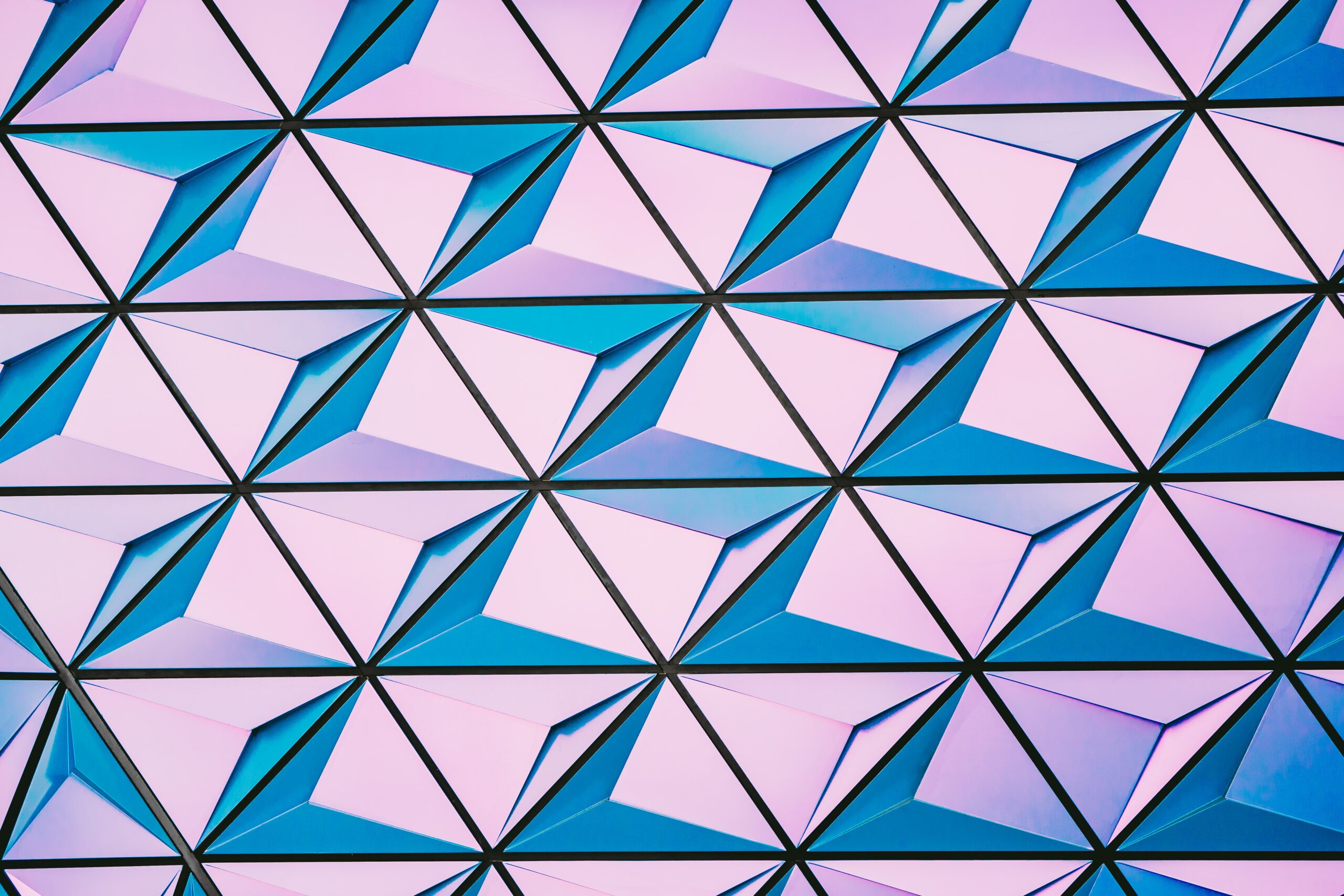
Play around with lines in your images, this will also need a bit of research. Lines play a more important role than you might think. Lines guide the audience’s eye to the focal point of your image.
The user’s eyes follow the lines in your image to go through it, you can use these lines to create a visual journey. Pay attention to where the lines lead your users, and how you can best draw their attention to the most important elements in the image.
3. Play with Typography
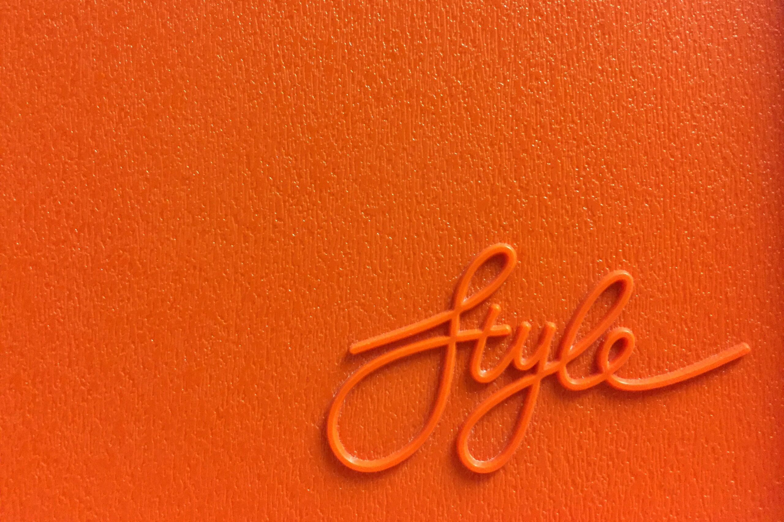
Similar to lines, the typography used the right way can be a game-changer for your images. Experiment with different fonts, don’t be afraid to use different fonts within the same image. Asymmetry in typography can be very visually appealing if done right.
And similar to lines, fonts can be used to direct the viewer to the most important elements in your image. It’s important to make sure your images are still readable, no matter what font or typography you use.
Unless you’re going for abstraction, your images need to be quickly readable and require minimum effort. People in the digital age are not exactly known for their high attention spans!
4. Experiment with Contrast
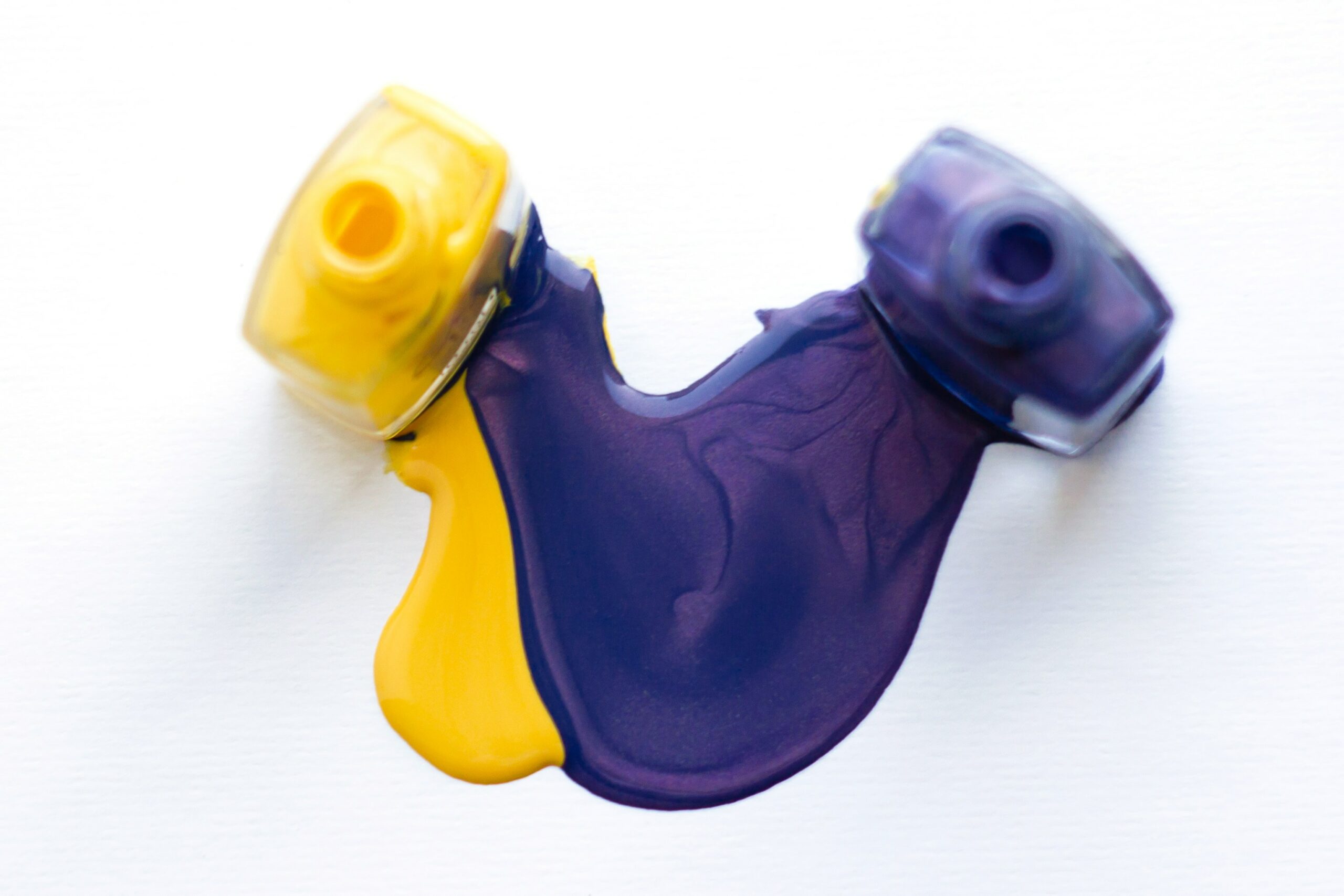
Whether you’re creating graphics or editing images, they need to pop! A lack of contrast can make your images look flat and dull. Experiment a bit with the contrasts in your images, not simply in editing but in colors and tones.
The colors you pick, and what elements you create with them need to be thought out. The element you want to pull the audience’s focus into should pop while other elements can be more muted so the focus is pulled away from them.
Darker colors against muted backgrounds and vice versa can greatly help make your work look more creative and vibrant. Designers can often get stuck working with the same palette, but if you have the liberties to incorporate more colors, go right ahead and experiment!
It’s also important to be careful not to go overboard with the contrast! Too much contrast can make images look harsh and amateurish. Play around with high and low tones, different color contrasts, and see what works best.
5. Scaling
Not every element in your images needs to be the same scale. Experimenting with different sizes and scaling can make your images look more exciting and trendy. Asymmetry done right can work in the favour of your designs. Use scaling to draw attention to certain elements and away from certain elements.
Scaling also helps draw the audience in given you use something attention-grabbing and compelling as a dominant element in your design. A quote or statistic or fun fact is excellent for drawing user attention to text images. On the other hand, a catchy picture or bright colors, in general, are great for images.
Think of it like “clickbait” in a sense, your images need to have some degree of clickbait elements to draw focus to them. Scaling is an excellent tool at your disposal that can help you achieve this effect.
6. Declutter
Declutter your designs! Unless you’re going for an abstract effect, get rid of any element that isn’t necessary to the overall aesthetic or content. Use space to give your designs a cleaner look. Not every inch of your design needs something, leaning into the simplicity can be a game-changer for it!
If you’re working with colorful elements, it’s especially important to utilize negative space. Spacing the elements out against a contrasting background will help them stand out even more. You can achieve this with both black and white base colors depending on what the overall aesthetic of the design requires.
7. Hierarchy
Establish a hierarchy of elements before you begin creating a design, going from most to least important.
Especially if your images are a part of a sales funnel, it’s integral to get the most important bits of information out first. Establishing a hierarchy depends on what your design’s priorities are, what are you looking to achieve with your images? Are they sales images? Are they infographics? What purpose do they serve?
This will help you decide which elements get more attention than some of the others. Primary, secondary, and supplementary messaging all need to be decided before you create an image design.
8. Follow a Direction
Did you know that users read images in specific patterns? They either read in an “F”, “Z” or “E” pattern. This means that their eyes follow a specific direction when scanning an image.
This is why we’ve stressed the importance of creating a path or ‘visual journey’ for your audience to follow, through lines, hierarchies, and typography. Your designs need to follow a direction and place elements strategically where the user’s eye goes first to get the most out of your images.
Create your images with one of the “E”, “F” or “Z” patterns in mind and position the most important elements accordingly. This will grab the user’s attention according to your priorities and help them along the visual journey you’re creating!
+ Bonus Tip
9. Consistency
Establish a set of typography and colors for your images. This doesn’t need to be a hard and fast rule, you don’t need to commit to a certain aesthetic forever, treat colors and fonts as temporary frameworks.
Especially if we’re talking about social media feeds, it’s important to maintain some consistency so your feed looks uniform. Decide a ‘theme’ for your feed and stick to it for a batch of your work, then when you get bored, simply switch to a different theme.
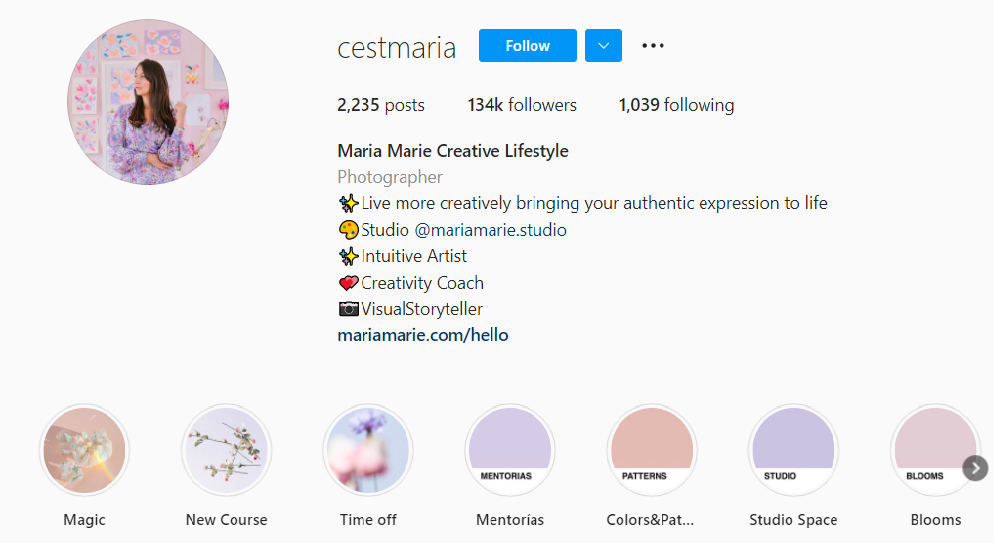
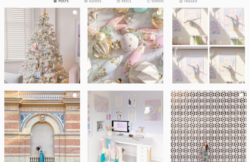
Take this Instagram feed as an example, the color palette pulls the feed together, creating a sense of cohesion. Even though the images are all different, they contribute to the overall aesthetic of the feed perfectly, without compromising their individual qualities.
Consistency is key if you’re creating images for social media or a website, as it plays a significant role in building engagement with your audience. Similar to colors, pick out a set of fonts that you’ll restrict your image design to, these don’t have to be one or two fonts, you can have three or four depending on your preferences.
The key is to stick to a set and create content that is consistent with the predetermined theme.
If you’re a designer and are feeling a creative block, worry not! The internet is a magical place with fresh, new content every single day that is bound to kickstart some creative inspiration in you.
Top 5 creators to follow for design inspiration in 2022
As 2021 comes to a close, you’re probably feeling like you’ve maxed out every idea that could freshen up your content. Now that we’ve gone over the design tips, let’s take a look at some of the best illustrators and designers to follow in 2022 for inspiration!
1. Yukai Du
Yukai Du is a graphic designer; she creates eclectic animations and still images. She uses lines and blocks for her incredibly creative images.
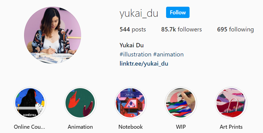
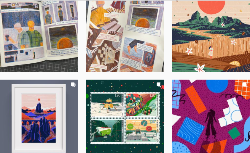
Although the designs can look pretty simple at a first glance, a closer look will demonstrate the artist’s ingenious use of lines and patterns in her work. Every element works together to create a uniform piece of design!
2. Andrea Stan
Andrea Stan is a letterer and designer. Her feed is an excellent place for inspiration if you’re into trendy image designs and logos. Her use of typography in her designs is also impressively masterful.
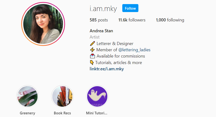
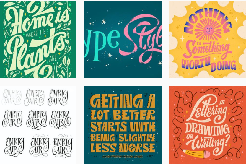
Eccentric typography placed against even base colors helps the text stand out perfectly. If you’re looking for inspiration on how to kick your text-image designs up a notch, this is definitely worth a visit!
3. James White
James White is a digital artist whose feed is one big dose of 80’s nostalgia blended with sci-fi aesthetics and colors.
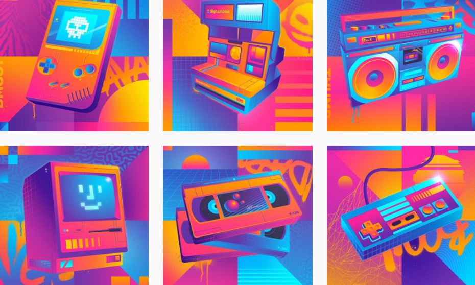 White’s attention to detail and masterful use of shapes and bright colors to illustrate the theme is exactly the kind of inspiration you need to do the same!
Even though his feed is consistent in terms of color palette and aesthetic, each image is unique and impressive on its own as well. We highly recommend visiting his feed for some design inspo in 2022!
4. Mary Kate McDevitt
Mary Kate McDevitt is a graphic designer and letterer. Her feed is excellent inspiration for aspiring letterers out that that need practice on playing around with typography.
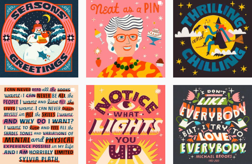 Her designs are simple, with only a few elements and colors, but her unique use of typography makes them look impressively creative and eye-catching. Her designs are incredibly popular and have even been featured in stationery.
5. Alex Perez
Alex Perez is another excellent graphic designer. His feed is the perfect inspiration for using lines right for your designs.
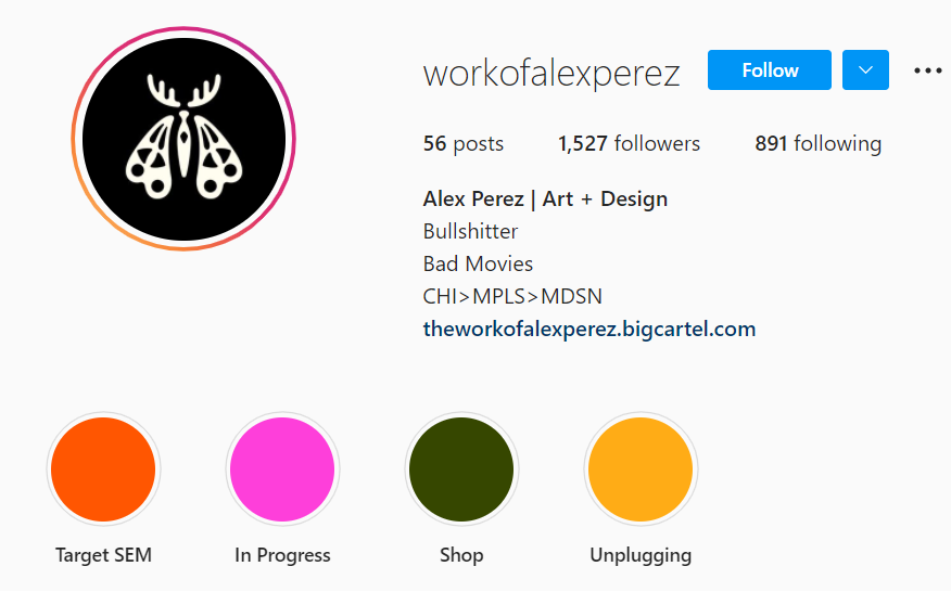
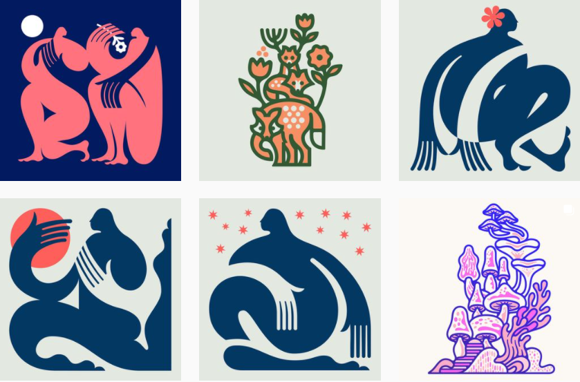 Perez’s feed also some impressive lettering inspiration for beginners. His image design is deceptively simple, however, if you look closely you’ll see how lines are used to guide the user’s eye in each design.
His designs are clean, with ample use of space used to help the elements of his designs pop.
Final Takeaway
The world of design is constantly evolving and changing; this means designers need to keep up and change alongside emerging trends. We hope these tips help you improve your design game and get the most out of your images.
In case you’re short on inspiration, visit the feeds we’ve recommended for a healthy dose of creative inspiration! Happy creating!


