
How can you use photography to level up your website’s user experience? Let’s find out.
Your website is the gateway to your company. And you only have 50 milliseconds to make a good impression.
If a user lands on your website and they instantly see too much text, it isn’t visually appealing, or it takes too long to load, there’s a good chance they are clicking out immediately and disappearing back into the blackhole of the internet. So how do you avoid this fate?
Thankfully, the answer is easier than you might think. A good user experience helps increase engagement, build trust, and drive sales. And a simple way to improve your site’s usability is by adding high-quality, custom photos.
Whether you use photos for menu items or as a part of a blog post, adding images to your website can help guide users through their journey. In this article, we’ll discuss how you can use photography to improve the user experience on your site — and what kind of impact it’ll have on conversion rates.
Let’s take a closer look.
What is user experience (UX)?
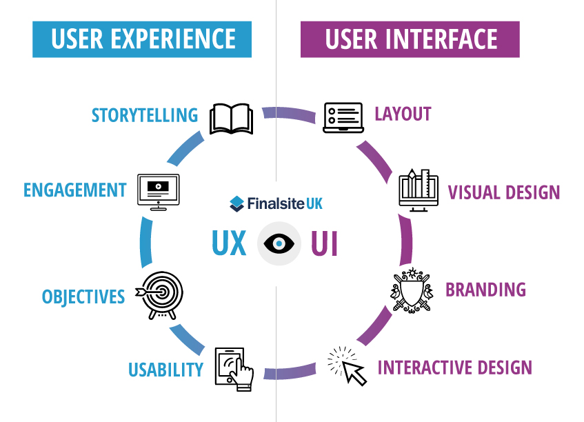
User experience (UX) is the art of how users interact with a website, app, or digital product which is often shaped by the collaborative efforts of designers and app developers. It includes everything from the visual design of your website, how easily people can navigate it, and the simplicity of performing specific actions like purchasing something or signing up for an account. Of course, UX isn’t just about how it looks — it’s also about how the user feels while interacting.
A good UX allows users to seamlessly accomplish what they need to without getting frustrated by confusing interfaces or unclear instructions. It’s all about the user’s journey and ensuring it is as smooth as possible. It should be intuitive, engaging, and fun — all while helping users accomplish their goals.
User experience (UX) vs. user interface (UI)
User experience (UX) and user interface (UI) are two of the most critical aspects of designing a website. While both are important, they’re often mixed up or used interchangeably. Here’s how to tell them apart.
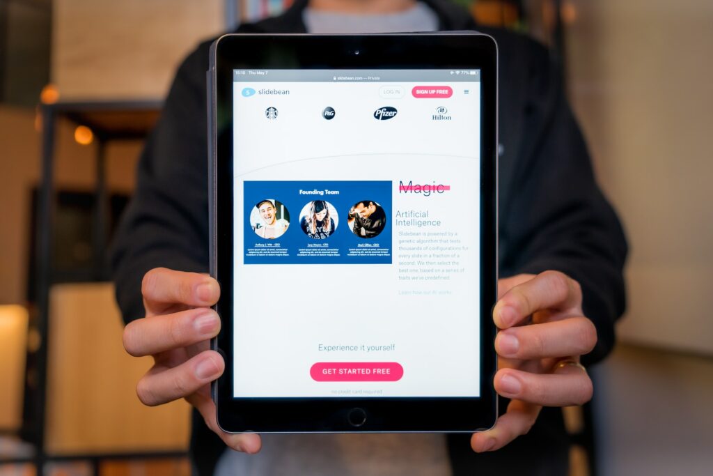
The user experience revolves around your users and how they interact with your website, including how easy it is for them to navigate from one page to another. If your site has a great UX, it’s easy for users to find what they need when they want it and make it through all the steps required to complete their desired tasks. However, if you have poor UX, users will get frustrated and leave your site before getting what they need.
User interface refers to how your site looks — and that includes everything from color scheme to font choice to images used throughout each page. It also includes buttons or links that allow users to navigate between pages or perform actions like signing up for an account or purchasing something online (these are called “interaction elements”). Good UI means having an attractive website that doesn’t distract visitors from doing the things they came for.
The amazing thing about photography is that not only do images help to improve your user experience, but it also plays a crucial role in the user interface and the overall aesthetic of your website.
The Power of Photos
When designing your website or creating content, you’ll want to avoid using too many words. Because the truth is, people don’t want to read — they’d rather look at pictures.
You know what they say: a picture is worth a thousand words.
If you’re not using pictures on your website, you’re missing countless opportunities to connect with your audience and improve conversions. In fact, studies show that adding just one image to your landing page can increase conversion by up to 80%.
So why not take advantage of the fact that people prefer images over text and use that to your benefit? There are a wide variety of visual tools that you can use to enhance the user experience on your website: infographics, vector images, photos, and videos all provide their own unique value for your audience.
Here are some ways that photography and visual elements can benefit your business:
- Make your site more visually appealing
- Draw attention and clicks to particular products or sections of your site
- Increase sales by showing off your products in an enticing way
- Help customers understand what they’re buying
5 Tips for Using Photography to Improve User Experience
Photography is a powerful tool for creating engaging, memorable experiences. Here are five best practices for using photography to improve user experience.
1. Pick a visual style that matches your brand
Brand consistency is the name of the game. Use the same visual style for your digital presence to keep your user experience consistent, like photos on product pages, blog posts, and social media platforms.
Make sure your branding looks and feels consistent across your digital platforms. It’s about creating a distinct identity for your company or organization so that people can recognize it no matter where they see it. Brand consistency can help you build stronger customer relationships by creating a cohesive experience across multiple touchpoints — from websites to social media pages to outreach campaigns.
Of course, this sounds like a lot of work. But thankfully, there are plenty of online tools available to help make this daunting task more bearable. For example, you may want to use an image editing API to make sure your images all have the same background and resolution quality for use on your website, social media and email newsletters.
Whole Foods, one of the largest natural grocery stores, does an excellent job with the design of its product page. They use different photos that meet dietary restrictions but also look similar enough to create a cohesive look that’s appealing to the eye.
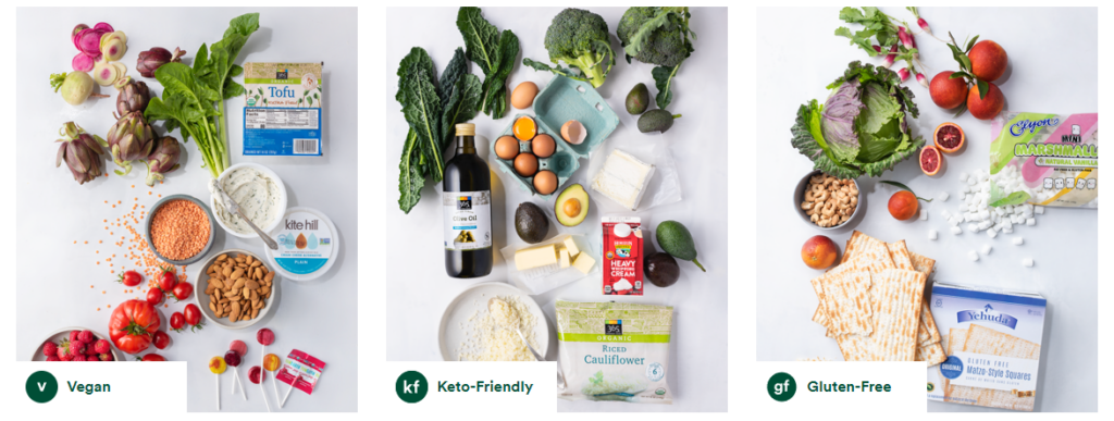
Whole Foods doesn’t stray from this visual style, even with so many different digital formats available online, from desktop to mobile devices to social media platforms like Facebook and Instagram.
Follow their lead by matching your brand identity across all platforms and devices to improve user experience and build trust with your customers.
2. Tailor images to the best format, resolution, and file size
If you are into photography, you probably know how to frame your shot and capture the perfect photo. But the work doesn’t stop there.
A high-quality photo is only half the story when creating a solid UX. You need to understand how to optimize your photos to fit appropriately on your website without slowing down the page speed or distorting the resolution.
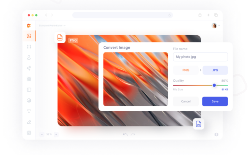
Image format
Regarding image file types, always use JPG for photos and PNG for logos and illustrations. Using a JPG format will guarantee that your photos load properly and not slow down your page’s load time.
Most images on websites can be JPGs, but sometimes PNGs are required. If so, use a conversion tool to turn a JPG into a PNG file. PNG images are larger and slower to load than JPGs, but they also support transparency and a higher quality.
Image resolution
Use high-resolution images that are ideally at least 1000 pixels wide. Large images are more accessible for users to read when displayed on their screens. If you have an image that’s too small and you try to scale it up, it can result in pixelation or distortion of the picture. Always try to use an image large enough for its purpose without the need for alteration.
Image file size
The size of images on your website depends on where you want to place them. The optimal file size of an image on a website is no more than 200 KB. For full-screen background images, aim between 1500 pixels and 2500 pixels wide. And for the rest of your photos, stick with a max width of 800 pixels. Keeping images between these perimeters will make sure they load properly on desktops, laptops and mobile devices.
3. Choose the right type of photography for the purpose
Using the correct type of photography for different purposes can improve your website’s user experience.
- Close-ups: Great for detail, but it can be challenging to see the whole story.
- Wide shots: Shows context and allows you to tell a story through images.
- Panoramas: Allows for sweeping views that give your audience a sense of location or space.
- Action shots: Helps convey movement and action while also sharing additional context.
- Portraits: Add a personal touch to your website.
Nike fills their website with action shots to show its fitness clothing in action. The more context you can provide your users with, the more likely they’ll engage in your content and understand your value.
These action shots resonate with their target audience better than a faceless model wearing athletic clothes against a white background.

4. Avoid stock photos
If you’re like us, you probably can’t stand stock photos. They’re generic and boring and don’t do anything for your brand. But what if we told you there was a way to replace those stock images with high-quality custom images that help your brand? It’s true. And it doesn’t even have to cost a lot of money.
The problem is that it’s easy to fall back on stock photos if you’re in a rush to get something out there. After all, they’re free and come with little work on your end — you can just download them, insert them into your website, and hit publish.
The problem is that readers don’t trust you when they see stock photos. They know that anyone can use those images. And when visitors doubt whether your website is legitimate or not, they’ll be less likely to stay.
Instead of using stock photos, try creating high-quality custom images yourself. It takes more time than downloading a stock photo, but investing in your visual content will pay off in the long run.
Stock photos don’t tell the story of who you are or what your business does. If you’re trying to tell a story with your brand’s image, don’t just rely on random pictures of people in a field of flowers. Instead, use high-quality custom images that show off exactly what makes your company unique:
- Products in action
- Customers using your product
- Your team is working hard at their jobs
Olipop is an example of a company that does a fantastic job of staying away from stock photos on its website. Instead, they use colorful images that share the best way to enjoy their healthy soda. These images are eye-catching and also show their product in an additional context.
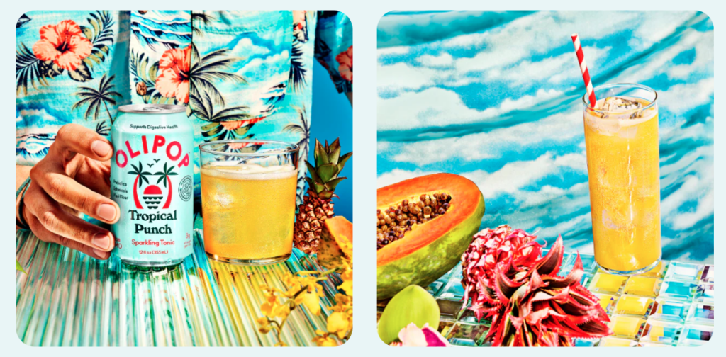
We know what you are thinking. These custom photos must cost a fortune. That might be the case here, but there are other ways to create unique images without breaking the bank.
Don’t underestimate the power of user-generated content (UGC). Depending on the content you want to feature on your website, you can continuously tap into your audience for inspiration. Try embedding social media such as Instagram posts and videos or adding relevant and engaging tweet screenshots that have been trending. You’ll be surprised at the quality of content you can score from your customer base.
Still not sure about this approach? Don’t overthink it. In fact, millennials trust user-generated content 50% more than original content created by brands. So UGC is worth a try.
5. Use meaningful context clues when possible
When designing a website, you must understand what action you are trying to get your users to complete. Are you trying to get them to purchase a product or sign up for your newsletter?
Use context clues — text, icons, and other visual elements — to help people understand what they are looking at and take action.
For instance, Away luggage creates sleek suitcases for the modern traveler. They sell many types of suitcases on their website, from carry-ons to large checked bags in various colors. But sometimes, it’s hard to tell the tale of something through an image alone. For example, you can barely distinguish the difference between the suitcase on the left and the suitcase on the right.
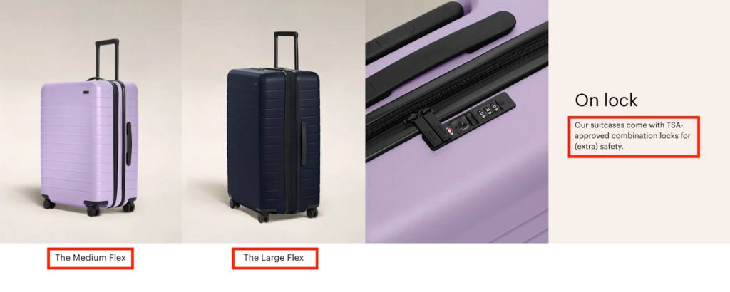
The context clue in this example is the name of the suitcase “medium flex” and “large flex”. It helps visitors understand that the suitcase is a different size and not just a different color. They also describe the lock that’s not visible in the original photos. These context clues help enhance the value of the photos and allow users to make informed purchasing decisions and increase conversion rates.
Wrapping up
We hope this article inspires you to use photography to improve your website’s user experience.
These simple tips can go a long way in improving your site’s overall look and feel, making it easier for customers to navigate their options and make informed purchase decisions. And to top it all off, a human-centered design is more important than ever when it comes down to creating a positive experience for site visitors.
Get your creative juices flowing and start creating custom images for your site today.
About Guest Author: Kelly Moser
Kelly is the co-founder and editor at Home & Jet, a digital magazine for the modern era. She’s also an expert in freelance writing and content marketing for SaaS, Fintech, and ecommerce startups.


