Have you ever been told to avoid yellow in your wardrobe? It makes you look like you have jaundice. Have you ever wondered why? I’m here to tell you that it’s not because of your skin tone.
It’s because yellow is the opposite of complementary colors, and complementary colors are a great way to make yourself look good. It is crucial to know the right colors that will complement your skin.
But what is a complementary color and what complements the color yellow? We will discuss this as we go along with this article.
The Color Wheel
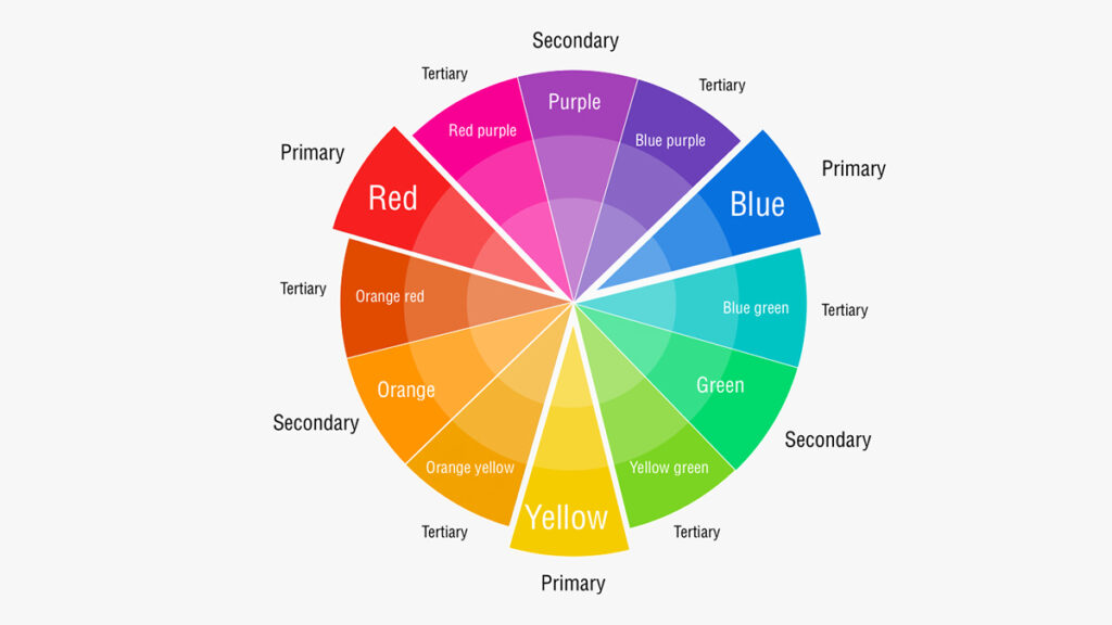
Before we discuss this further, you will need to be introduced to the Color Wheel. The color wheel is a circle of colors that show how they relate to each other. The primary colors are red, yellow, and blue.
These are considered “primary” because they cannot be created by mixing any other colors together—they’re made from light itself.
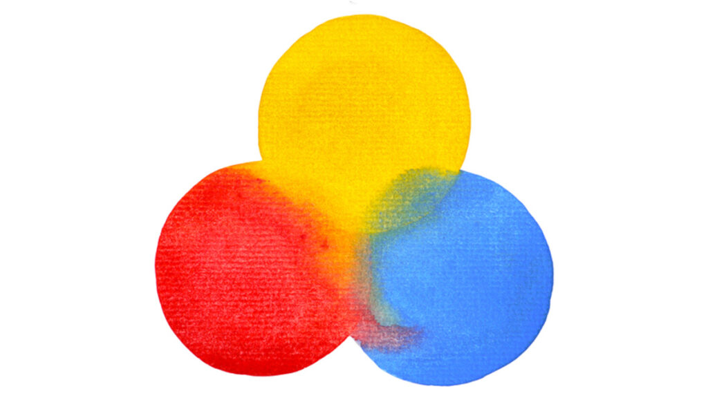
Secondary colors are produced when two primaries are mixed together: green (yellow + blue), purple (red + blue), orange (yellow + red), etc. Tertiary colors represent a combination of one primary and one secondary color: red-orange, yellow-green, and so forth.
Primary Colors
There are only three primary colors, and they’re red, blue, and yellow. If you were to mix two of these together, you’d get the secondary colors:
- Purple is made by mixing red and blue
- Green is made by mixing yellow and blue
- Orange is made by mixing red and yellow
Red
Red is the color of fire, blood, and roses. It’s a warm color that evokes feelings of passion, energy, and love. A bold hue that can be used in large doses, it also makes an excellent accent to another color or pattern to give your space a bold statement piece.
While it’s often associated with anger or danger, it’s actually the most life-affirming of all colors. It symbolizes both passions for others and for ourselves—and as such is often used in fashion to suggest sexuality or sensuality.
Blue
Blue is the color of the sky and the sea. It’s also the color of rivers, lakes, and streams. If you were to look at a landscape painting, blue would be one of its most common colors.
Blue is a cool color because it has more blue in it than other colors. Cool colors include green and violet (purple).
Yellow
Yellow is a warm color. It’s also a primary color and the color of the sun. This makes yellow very strong and powerful, which can be good or bad depending on how you use it.
Yellow represents intellect, clarity, and communication. Some other things that are associated with yellow include daffodils, daisies, mustard, and buttercups.
Complimentary Colors
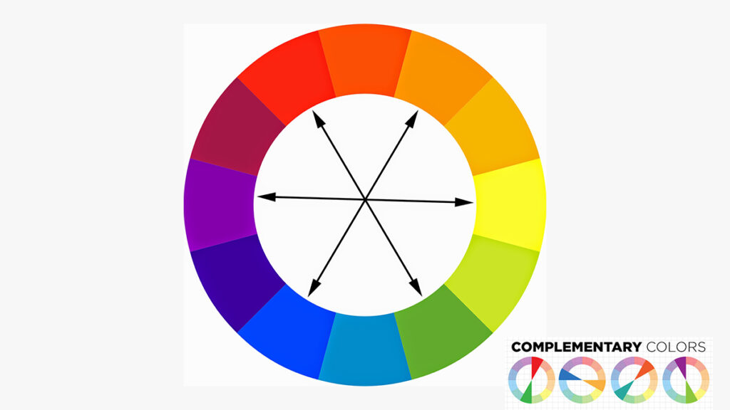
Complimentary colors are the opposite of each other on the color wheel. The most common complementary combination is yellow and purple, though other combinations exist: red and green, blue and orange, etc.
In art classes, we were taught that complementary colors are best used together in order to create contrast. This is especially true if you’re using them as large blocks of color rather than shades or tints (more on those when we get to them).
Red & Green
Red and green are opposite on the color wheel. They are complementary colors, which means they look their best when used together.
Because they’re opposites, they don’t work well in the same painting unless you want one of them to be the focal point or accent color.
Blue & Orange
Complements. Blue and orange are complements. This means they’re on opposite sides of the color wheel, and when they are paired together, they create purple, green, or red with equal amounts of each color.
Purple is a mixture of red + blue = purple.
Green is a mixture of yellow + blue = green
Red is a mixture of red + yellow = red
Yellow & Purple (Violet)
The color wheel is a useful tool to help you choose colors that work well with each other. In this lesson, we’ll be looking at yellow and purple (also known as violet), which are complementary colors. You can think of them as opposites on the color wheel.
The only two colors that are directly opposite each other on the wheel are yellow/purple and orange/blue. They’re also known as complementary or opposing pairs because they’re related by their position on opposite sides of a straight line from red down to the green.
Every Color Has a Complementary Color
The complementary color of color is the one directly opposite it on the color wheel. For example, blue and orange are complements. Yellow and purple are also complimented. In general, warm colors are complements of cool colors (think yellow and blue), but not always (think red and green).
Complementary colors have interesting effects when they’re used together in design projects. You can use them side-by-side to create a high-contrast look or use them in different hues for a more subtle effect that still uses complementary hues within your palette.
What Color is Opposite of Yellow?
The opposite of yellow is purple. Purples are very subtle, and they range from deep amethysts to light lilacs. You can also find purples in the sky at dusk or dawn when the sun is at a low angle—this will create a purple hue on your face if you look at it directly.
But if you look at everything that has to do with the color purple, you’ll find that it all has to do with the shade of blue. This is no surprise as purple is a mixture of blue and red and, thus, sits between the two on the color wheel.
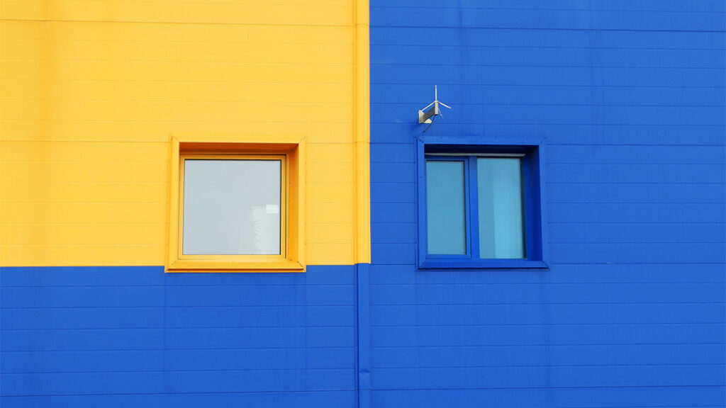
Blue is also opposite yellow on an RGB color wheel. Blue is 255 blue, 0 red, and 0 green. Yellow and blue are opposites since blue doesn’t include yellow’s ingredients.
Nature also has a way of telling you that the shade of blue always compliments the shade of yellow. Here are some examples:
- Yellow and blue eyes
- Yellow and blue skies
- Yellow and blue oceans
Changing Background Color Using Colorcinch
Take a look at this photo of a sunflower. It looks pretty isn’t? However, something is not right. The background color does not complement the sunflower enough.

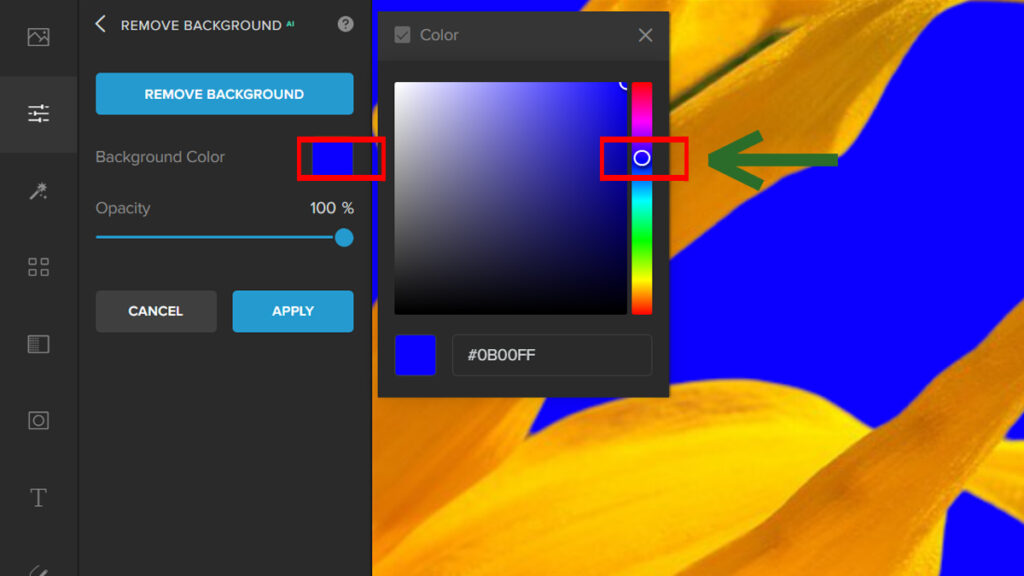
We can correct this by changing the background color in Colorcinch.
Step 1: Open Colorcinch and Upload the image.

Step 2: Navigate to Edit — Remove Background.

Step 3: Once the background has been removed, click on Background Color and pick any color of your choice. For this example, we will choose the color blue.
Let’s take a look at the difference:


Conclusion
While there are many other color schemes out there, complementary colors seem to be the most popular and widely used.
They can help you as a guide to achieving the correct wardrobe that suits you depending on what look you’re going for—whether it’s a moody, muted vibe or something bolder.
Not only for fashion but knowing the color theory will be helpful to your daily lives. We hope you’ve learned something new from this article. Be sure like and comment.


