
Imagine describing a visual scene in words – just how clearly are we able to deliver our message?
Let me tell you about some boats. There are five boats in the water not far from the shore. One big boat, two medium sized boats and two little ones. The two little boats are on the left of the big boat. One medium-sized boat is in front of the big boat and the other one is behind the big boat. The water is deep blue and crystal clear. You can count each and every rock in the water. Most are submerged but a few rise above the water.
Does this sound boring and redundant to you? It does to me.
Why describe it in words when I can just show you this picture:

The thing about text is that you first have to read it, then make sense out of it and only once you understand it, can you finally form an image of it in your head. That’s a lot of work.
Even then, the image you form may turn out to be different from what the person was trying to convey
Imagine going through your everyday social media content but it’s all in text. Sounds horrible right?
Social media has become a place where we don’t just share personal updates, but are also actively consuming content and interacting with businesses at an extremely rapid rate.
The inclusion of visuals in posts has led to an increase in engagement by 37% on Facebook and 35% on Twitter. A study by Buzzsumo found that on an average, posts with images receive 2.3 times more engagement.
In this article, we’ll take a look into how visuals play a big part in audience engagement and how you can optimize yours.
Why are visuals so important?
Let’s break down the reasons for why images do so well on social media.
1. We’re hardwired to process visuals faster.
Back in the time of the first humans, our ancestors were heavily dependent on their sense of sight to identify food or danger in the wild. Over the years, we’ve had an evolutionary reliance on our vision.
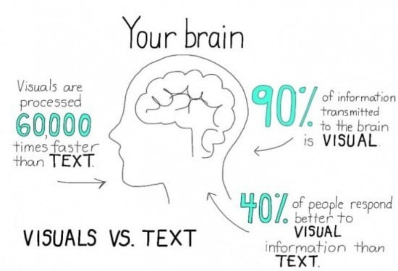
From the time we are born, it’s our eyes we depend upon to understand the world around us. It takes our eyes only 150 milliseconds to identify images or symbols and just 100 milliseconds to give meaning to it.
Our brain can process images 60,000 times faster than words and text and also retains 80 percent of what we see as opposed to just 20 percent of what we read.
2. We love color.
Colors are visual cues. They influence our moods and feelings. When we see an image, our brain passes a judgment on it, and 62-90 percent of this judgment is made on the basis of color alone.
Smart usage of colors can contribute to evoking positive or negative emotions, and also emphasizing and de-emphasizing certain areas of the image.
3. We like to see faces and expressions.
Imagine your boss sends you this message: “Come see me in my office”.

That’s a bit scary right? You don’t know what to expect.
What about- “Come see me in my office :)”?
That’s much better.
An expression sets the tone for any kind of communication. Research shows that we’ve started to perceive emoticons the same way we perceive real faces.
In fact, recognizing faces and people is so important to us that a whole section of our brain is dedicated to just that. It’s called the fusiform gyrus. When we see a face, the neurons in our brain become extremely active and excited.
So next time you post something, consider adding a face to it. Or better yet, a familiar face. Make that fusiform gyrus happy.
4. We crave simplicity in this complex world.
To the mind, images and symbols are simple. We are born to perceive information visually.
Reading and writing come later with time.
This is why infographics work so well. They break down complicated information into smaller, easily digestible chunks and give it to you in a visually attractive format.
This is also the reason why road signs rarely have any text. A symbol depicting students crossing a road is easier to understand than a sign that reads ‘Slow down! There are children crossing the road ahead!’
5. We remember images better.
Think about the first time you rode a bike. How old were you? Who taught you?
Can you picture it in your head?

We tie images to memories. That’s how we’re tuned to remember things. We don’t remember things in words or sounds, only visually.
Studies show that after 3 days of reading text alone, we only remember 10% of it. But if we present the same text along with a picture, we’ll remember 65% of it.
The many types of visuals you can use on social media
It’s a good idea to have multiple types of visuals in your arsenal. Some are easy to get and some require work and money. But serve your audience a good mix of visuals and you’ll never become monotonous.
1. Photography
Original photography brings in a whole lot of social currency. These are authentic and share your unique perspective with your followers. Your followers immediately feel a sense of connection with you when they see the world through your lens (literally).
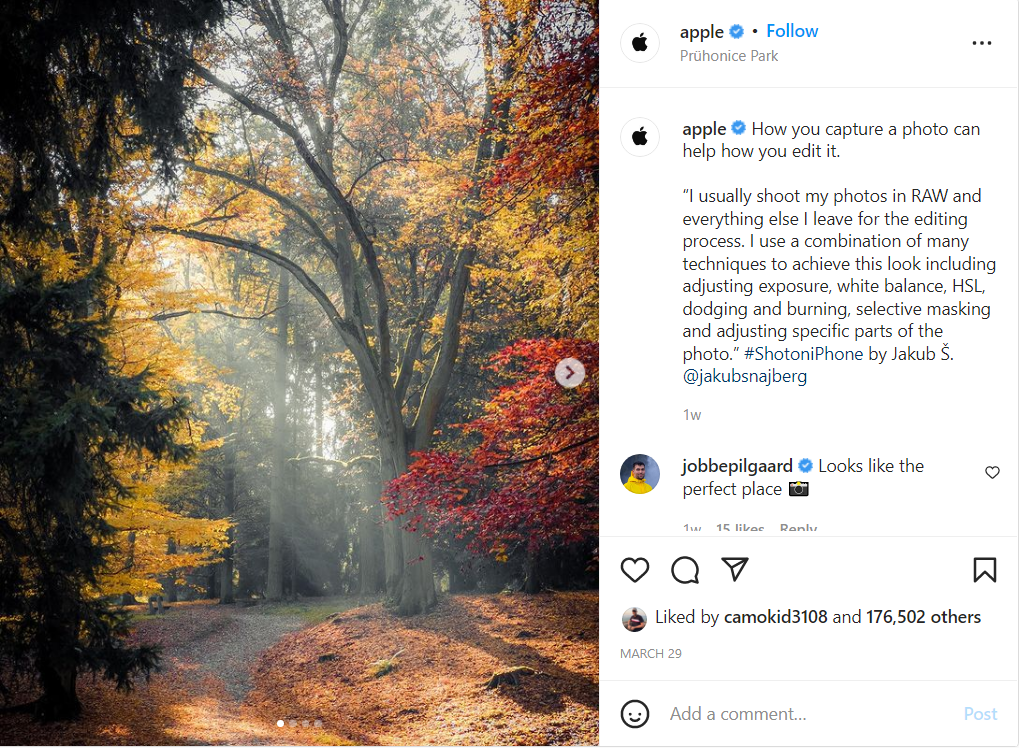
While it is true that photography involves a lot of money and time, you don’t always need a professional photographer to take photos for you. A quick smartphone snap can also work most of the time. So be sure to be posting plenty of your photography.
2. Stock photographs
Why spend valuable time and resources into original photography when you can get high quality stock photographs instead? Some feel that stock photography is overused and would fail to engage with the audience.
But this is not true, stock photographs are designed to attract the audience and drive them into engagement.
What you must ensure is that the stock photograph falls in line with what you’re trying to convey and is edited to look like it belongs to your brand.
3. Illustrations
Digital artwork provides an attractive alternative to photography. Illustrations help convey complex ideas and information in a way that’s pleasing to the eye and easy to consume. What’s more is that they can give your brand a voice or tone and can help you weave specific narratives.

Based on the style you choose, you can make your content feel fresh and new, sophisticated and cool, trustworthy and dependable or any other sensation you want your audience to feel.
4. Text as a visual element
Sometimes words are more powerful than an image. That or you neither have the budget, nor the time for graphic design and photography. Either way, you can always get creative and turn your text into a visual element.
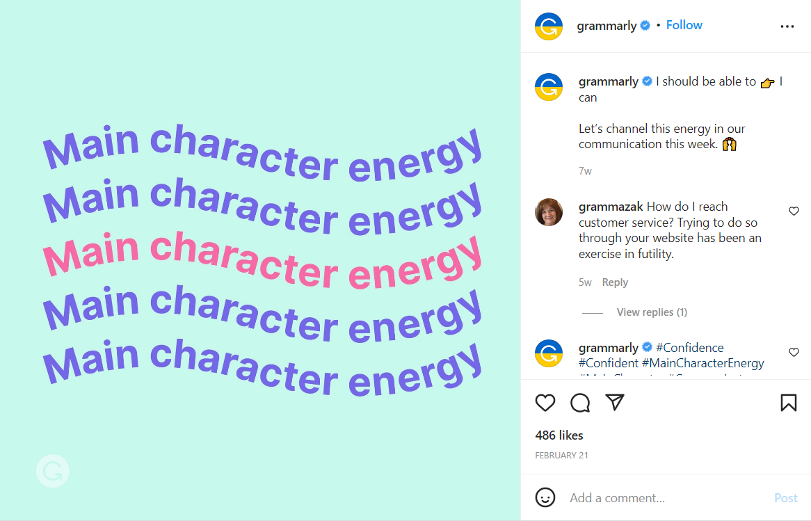
Pick out some elements from the text that you think are especially fun or interesting for your readers, and explore how you can make them stand out visually.
For example, pick a fun quote, play with its font, size, style, colors and placement. Choose a fun background that makes the text pop and voila, there you have it.
5. Data visualization
A line of numbers is complicated and unappealing. Put that data into colorful, creative graphs, charts and other visualizations of facts and it’ll draw readers in to make sense of complicated data.
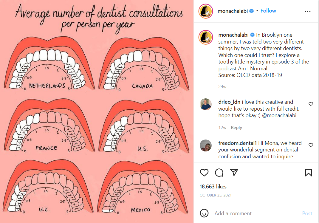
This is why infographics will always remain popular, they’re easily shareable and break down complex information in a way that anyone can follow along and understand.
Here’s how you ensure your image game is strong
With the millions of images being uploaded onto social networks each day, how do you ensure yours is among the best?
Here are a few techniques that’ll ensure that your images are always engaging:
1. Competitor analysis
It’s a good idea to analyze what your competitors are doing with their image strategy. Understand what kind of visuals they use, what colors they use and what fonts they use. Understand their strengths and identify their weaknesses.

There are many tools and tactics you can use for this activity, including generating a special Instagram social media report that compares the best performing visuals of your competitors.
This will help you make a comprehensive image strategy that’s set to beat your competitors and engage with your audience.
2. Play on emotion and sentiment
The way to resonate with your audience is to form an emotional connection with them.
It’s the key to having a long-lasting impact on your audience.
Now I’m not saying start posting images that’ll get your audience emotional. I’m talking about simple emotional responses, like laughter. Getting your audience to literally laugh out loud will make it more likely for them to like, share, comment and remember the visuals.

Another way to do this is by understanding how your audience feels about trending topics and images. Do this by performing a sentiment analysis on these images. Once you know how your audience feels about it, you can post images that validate and reinforce what your audience feels about the topic.
3. Identify the right elements
Let’s take a look at Amazon Prime. Amazon Prime usually posts scenes and memes taken directly from its own OTT content. An infographic or stock image probably won’t work for them.
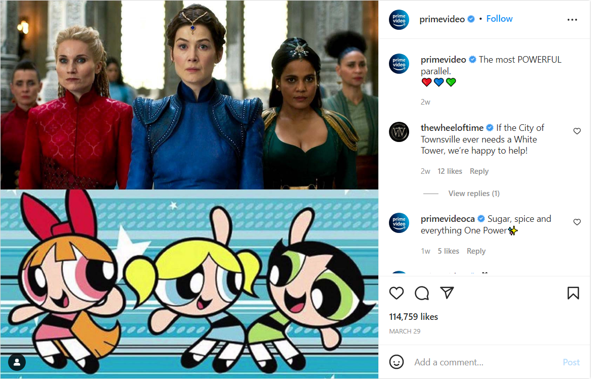
On the other hand, a social media analytics software like Radarr is better off posting data visualizations and infographics rather than photography and stock images.
You need to explore and first determine what elements bring a positive response for you. Based on what’s working, you focus your efforts on those elements that are relevant to you. Thus there’s really no point in going all in and blindly using all elements and formats.
4. It’s all about telling a story
Images are a medium through which we tell stories. Every visual you post tells the story of the post and also contributes to the story of your brand.
This is why you should never stuff your posts with random images, like this.

Data visualizations work because they take numbers and weave a story out of them. Text as an image works because the colors, size and font, all tell the user a story.
Every post has a narrative and the image needs to be contributing to it. The images you post need to either make it more understandable or more entertaining for the user.
5. Monitor image impact and optimize on the go
It’s a good idea to track your images across the digital landscape. You can monitor the impact of your visuals through image analytics.
Image analytics is a process of identifying information and data from images on the internet using AI. Thus, it can recognize attributes in an image and help you judge how impactful it really is.
You can make edits and additions to the images based on the result to ensure it gives you the desired impact.
Make this a part of your image strategy process to ensure all your visuals are up to the mark and will bring engagement.
Final Words
The trick lies in knowing your own audience and creating an image strategy that is tailored specifically for them. Visual content is a uniquely attractive way of putting across your value proposition and reaching out to potential customers. When done right, it’s among the most powerful online marketing tools that the social media world has ever seen.
Guest Author: Soham Khatri


