

Do you want to create a stunning graphic but are not good at designing? If yes, there is nothing to worry about. In this article, we are going to provide you with some essential design tips. So, if you are a non-designer who has never crafted any visuals, this guide is worth reading for you.
Ready to set off on an informative journey regarding graphic design? Let’s get started.
Start With Having A Design Inspiration
There is always a creative idea behind every unique design. However, the fact is, those who are not experts in designing often struggle to come up with distinct design concepts. But worry not; this is natural; it happens to nearly every non-designer. To overcome creative block, it’s always a good idea to have a clear inspiration before designing any visual.
In case you already have a design that inspires you, explore more like it. Wondering how to do it? Well, just access an efficient AI image search tool, upload the intended picture to it, and initiate a visual search. The picture search results bring a vast collection of similar yet compelling images. By exploring the results, you can have a clear idea about how your design idea should look.
Use Online Design Tools, Not Offline Software
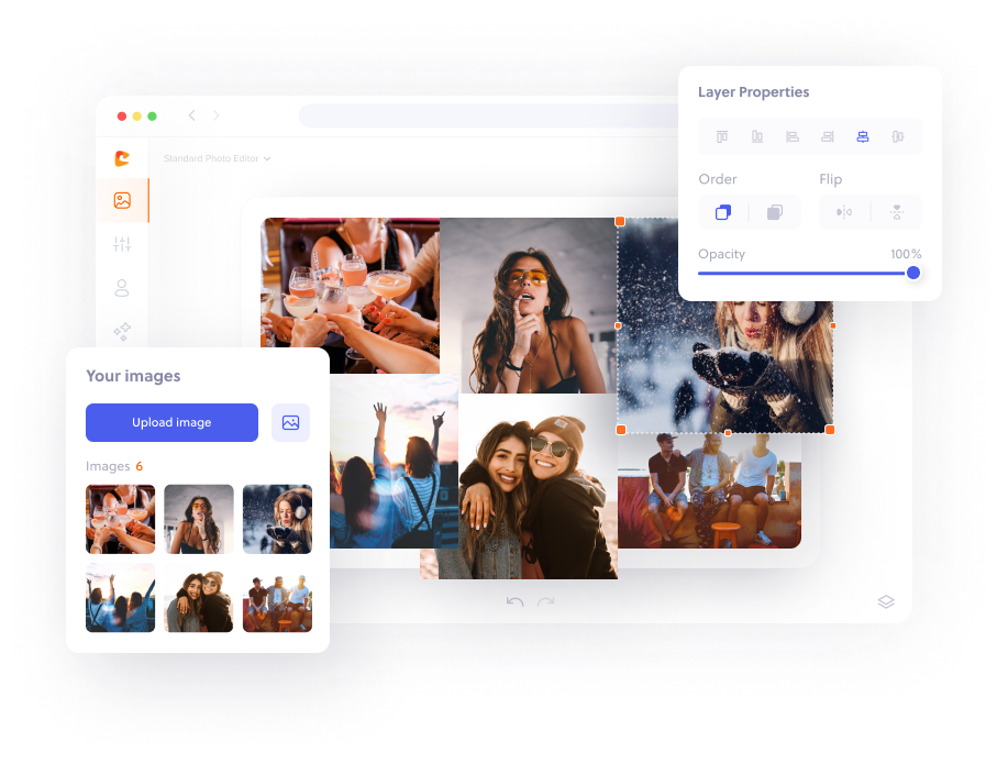
Being a non-designer, it’s quite hard to get familiar with the complex interface of offline design software. This is because such resources are specifically designed for professionals who know everything about designing. For those who are new to this field or need to create visuals occasionally, online design tools are the best.
Most of these tools come with a user-friendly editing interface and drag-and-drop functionality. Also, some efficient ones have built-in graphic libraries containing a large number of HD images and other high-quality graphical elements. Many of these tools also allow users to remove image backgrounds effortlessly, making the editing process even more seamless. In comparison to offline software, these tools are usually easier to use and offer a better editing experience.
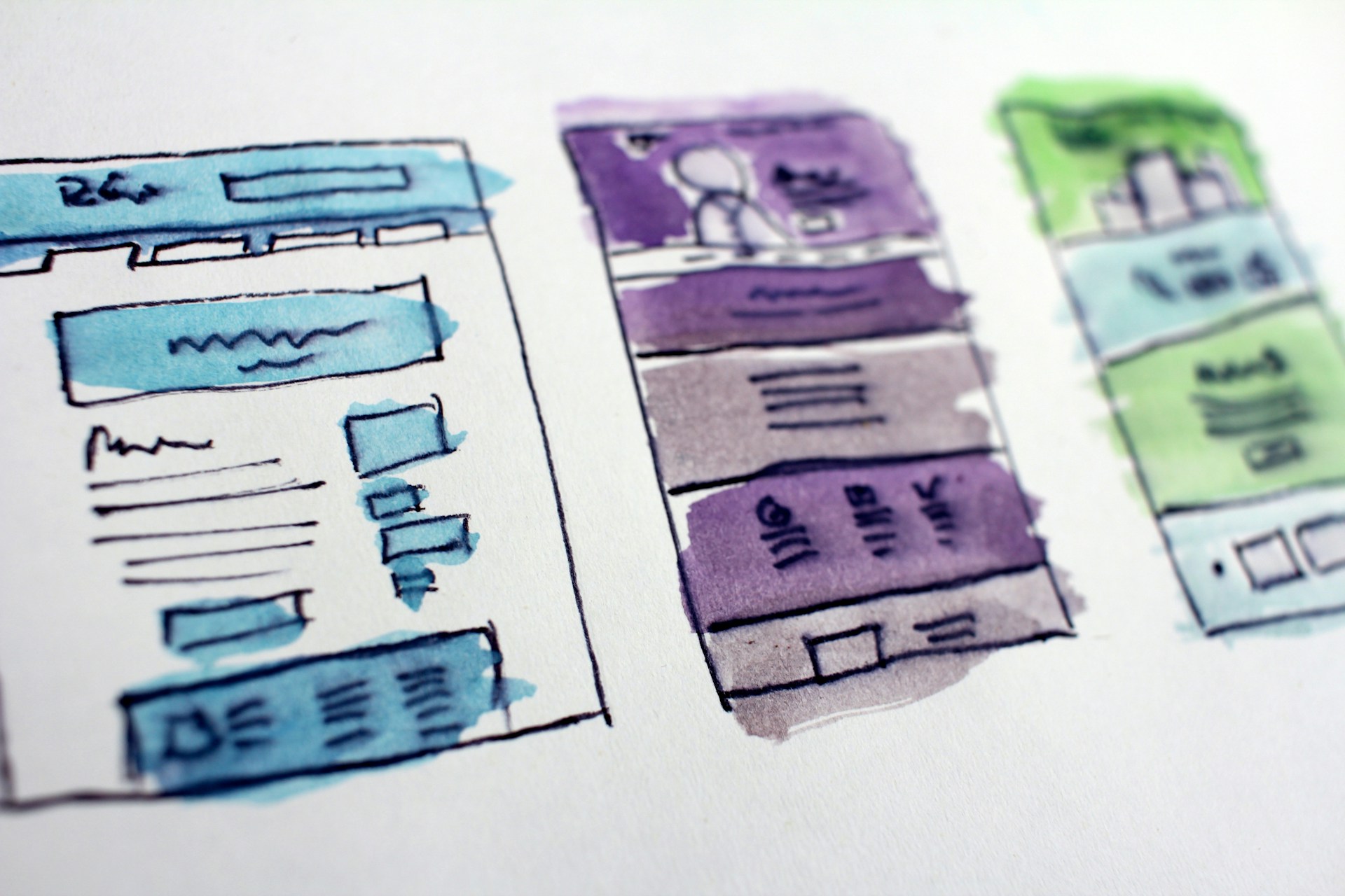
Choose The Right Template For Editing
Starting from scratch is quite difficult for non-designers. So, it’s better that you work on pre-made templates. However, the problem is that a single search for such ready-made resources can result in many options, leaving one confused about which one to choose. That’s why you should be careful while selecting any template for editing.
While choosing a template, keep the personality of your brand in mind. Also, don’t overlook the preferences of the audience for which you are going to create the design. Moreover, prefer templates with minimal structures. This approach will not only provide you with ease during editing but also help you create a visual that perfectly aligns with your needs.
Stick To Minimum Colors And Fonts
Since you don’t have enough knowledge about graphic design, your design sense is most probably not as good as that of a professional. However, with a mentoring software, you can easily connect with experienced professionals who can offer personalized guidance to help you refine your design skills.
Less familiarity with visual aesthetics might motivate you to incorporate many colors and fonts in your graphic. Remember, don’t do this practice at all. Using too many colors and fonts can make your design look cluttered.
That’s why you must stick to minimal pellets and typefaces. Since you will be using pre-made templates, there will already be a font hierarchy in the design, so make sure you don’t disturb it. However, you may alter the colors to bring the essence of your brand’s visual branding to the design.
Ensure Proper Alignment Of Every Element
The alignment of graphical elements plays an important role in making a visual appear professional. Even if you use existing templates, you will have to make sufficient changes to them, which might disturb the position of text, visuals, graphics, and other things. So, make sure that you align every element properly with respect to the other ones.
If you use online editing tools, you can find dedicated alignment options to refine the structure of your design. From positioning an element to the right, left, and in the middle to creating equal vertical and horizontal spacing, you can do many things. All you need to do is utilize these options to make your visual clean and well-organized.
Balance Text, Visuals, And Space
As a beginner or stranger to designing, you might make the mistake of stuffing your graphics with either images, text, or both. Remember, a good and elegant design always has a balanced usage of typography and imagery. And the thing that most non-designers ignore is the right use of white space between graphical elements, which is a bad practice.
That’s why keep in mind that there is no need to stuff your design with excessive things. Instead, try to convey the message using less text and pictures. To achieve elegance in the visual, make the appropriate use of negative space. Separate text, images, shapes, and vectors with the help of consistent spacing between them.
Additionally, consider using automation tools and exploring other people’s designs, but be mindful of rate limits to avoid errors like 429 Too Many Requests and keep your workflow efficient by optimizing your design processes.
Pay Close Attention To Emphasis
Remember, your designs should have a focal point. There must be a particular part in your visual that instantly grabs the attention of the viewer to the key message. Other than text, you can also emphasize a picture if needed. Highlighting the most important part of your graphic makes it clear for your audience what to focus on.
There could be multiple emphasizing techniques to draw the viewer’s attention to a point. For instance, you can use bold colors, utilize shadows, add outlines, blur the background, and enlarge the size of the font. Moreover, you can combine some of these effects to highlight the intended element further.
To Sum Up
After reading this guide, we hope that you have learned the most necessary things about designing. So, whether you have already made any designs or are doing it for the first time in your life, creating a stunning design doesn’t have to be difficult after going through these tips.