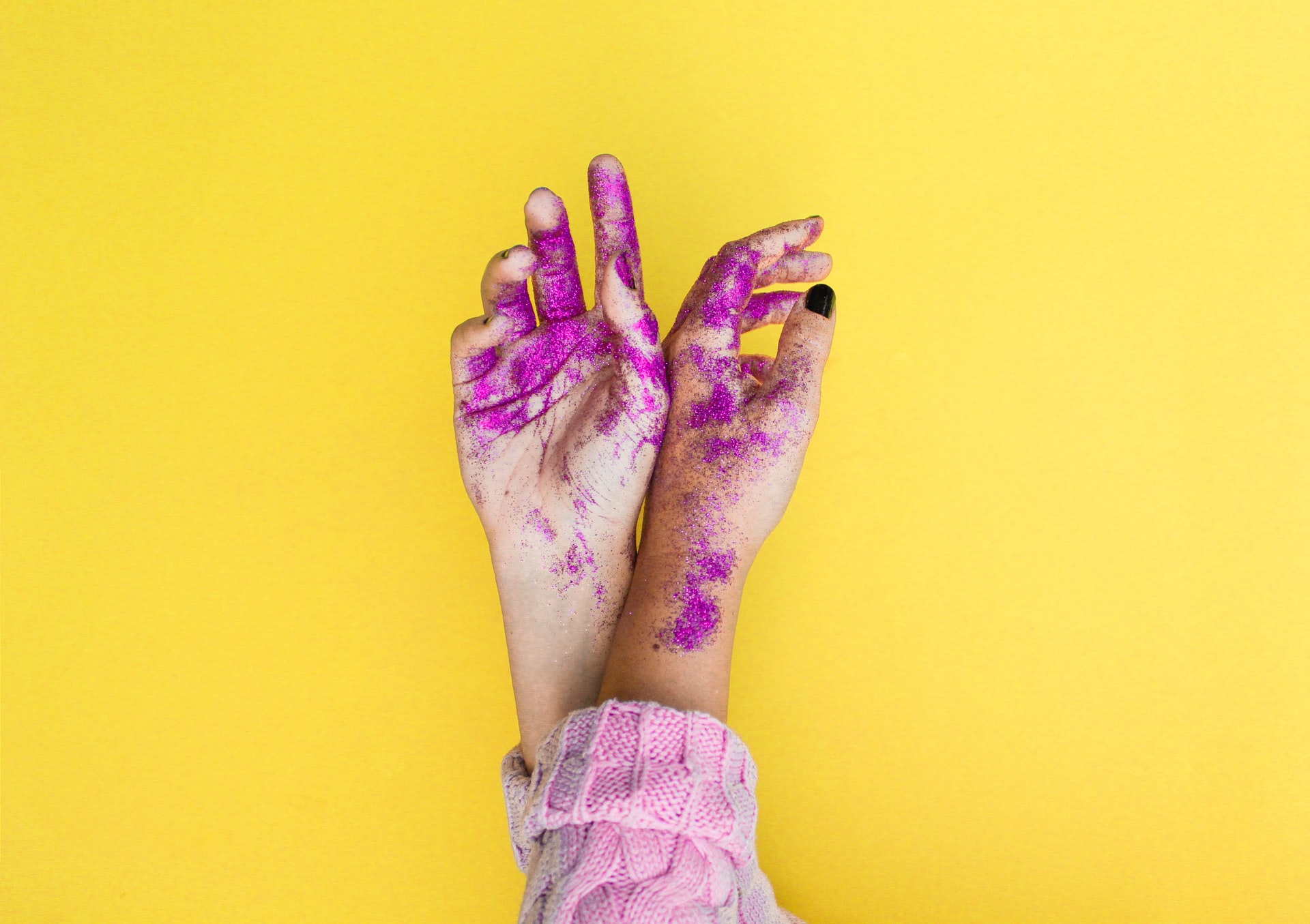
Watch out for these design trends!
Trends, trends, trends. You either hate them, love them, or don’t bother with them at all.
But the thing about trends is … they happen for a reason.
People establish trends when they notice an uprise in audience engagement. So, if they notice their audience is veering toward black and white photography over color, then their next step will be integrating more black and white photography into their portfolios.
If they notice that clean, modern fonts are in demand over dramatic, complex fonts, then what’s their next move? Steering away from complex fonts and opting for more modern ones instead.
In other words, trends are like guides. They’re here to steer us in the right direction or at the very least, show us a few new tricks of the trade.
By staying ahead of photo and design trends, you can ensure that you’re creating the visuals your audience is drawn to most.
If you’re curious what trends to be on the lookout for in 2022, we’ve got just the article for you.
In today’s article, we’re peeling back the curtain on photo and design trends along with why they’re important. We’re also sharing five trends you can start taking advantage of right away.
Ready to get started?
Here’s what you’ll learn today:
- Why is it important to take advantage of photo and design trends in 2022?
1. Using imagery to support diversity and inclusion movements
2. Making information more digestible with descriptive icons
3. Optimizing email marketing campaigns with responsive templates
4. Personalizing blog content with custom featured images
5. Enhancing palettes with the “color of the year”
- How to choose the right photo and design trends to capitalize on in 2022
- Wrap up
Why is it important to take advantage of photo and design trends in 2022?
Taking advantage of photo and design trends is important if you want your work and business to be seen. It’s not about throwing out your trademark photo and design choices. It’s about finding ways to add in new techniques to make your work even better.
Hopping on the trend bus may seem overwhelming, but the key is to capitalize on trends that make the most sense for your goals.
For instance, if you’re a portrait photographer, then keeping up with the latest urban photography trends may not be necessary. But trends like using vertical composition and trying your hand at iPhoneography might be worth checking out.
The same goes for design. If you’re a graphic designer specializing in logo creation, taking advantage of trends like 360 photography may not make sense. But trends like implementing the color of the year and optimizing for readability could uplevel your work in powerful ways.
Here are some other reasons it’s important to take advantage of photo and design trends:
1. Encourage virality by integrating the most current, popular trends
If increasing awareness is a goal of yours, infusing trends into your work might give you that extra visibility oomph you’re looking for.
2. Shapeshift your skills according to your audience’s changing needs and demands
Never lose sight of your audience’s changing demands. Nurture your audience with new photography and design work during every stage in the customer journey.
3. Learn new ways to demonstrate and work with art
Keep your muses and inspiration close by learning new ways to approach your art.
4. Always remain in a state of learning
Going through the same motions for years on end without learning new skills can turn design and photography stale. Implementing trends into your work can help you remain in a learning state — and improve your art in the long run.
1. Using imagery to support diversity and inclusion movements
While it’s unfortunate how late this trend popped up, we’re thankful it finally did.
Diversity and inclusion efforts are taking the world by storm, and the same couldn’t be more true for design and photography.
In today’s photography and design, we’re seeing more black, brown, Asian, and Arab people featured in campaigns, among other minority groups, too. We’re also seeing more body-positive images, including people of all shapes and sizes, and people with disabilities featured, as well.
In fact, diversity and inclusion trends are so prominent they’ve been making their way into branded style guides and company culture expectations.
If you peruse blogs often, you’ll see increasingly more diversity in featured images, like the one below in an article about gifting money to children.
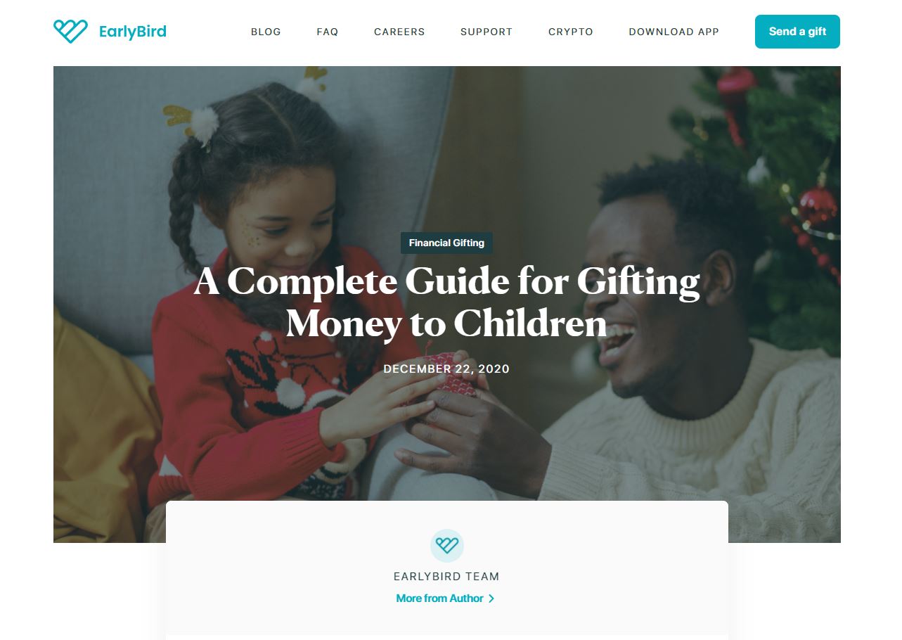
You’ll also notice that digital illustrations are more inclusive as well. From changing skin tones to using plus-size figures, illustrated people are no longer small and fair-toned but rather display a variety of shapes, sizes, and colors.

Some other ways diversity and inclusion movements are showing up in photography and design trends include:
- Gifs and memes (appropriate ones, of course)
- Stock images
- Company videos and testimonials
- Pop-culture references
- Fashion and hair photos
2. Making information more digestible with descriptive icons
In a Google-focused world, information is like currency — but only if it’s digestible.
The days of jargon-filled writing and using complex graphics are long gone. Today, information must be valuable, relatable, personalized, and most importantly, easy to understand.
The cost of not making information easy to understand? Risking not being seen.
If your information is cluttered and lacks proper structure and images, search engines won’t rank your content well. If organic marketing is a key pillar in your growth plan, that’s a big deal.
When it comes to trends, we’re seeing a lot of descriptive icons that make information more digestible.
For instance, if you take a look at the information listed on this invoice parsing page, you’ll notice descriptive icons are placed above features, like this example shows:
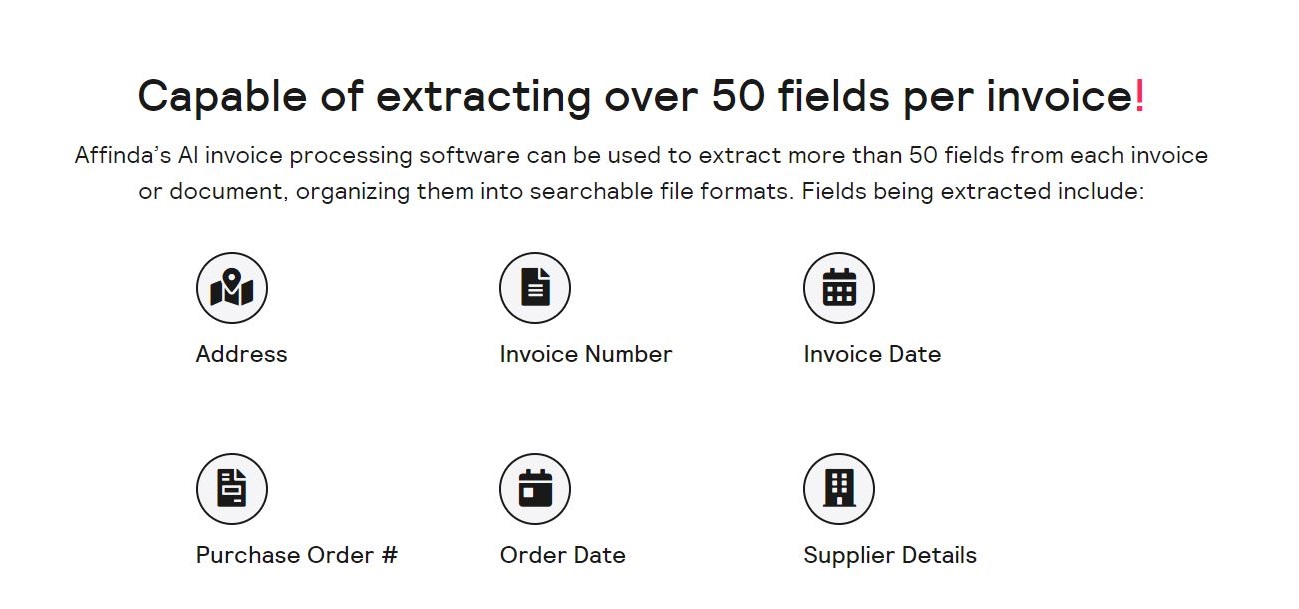
Reading a plethora of features isn’t just tiring. It’s boring, too.
Including something as simple as descriptive icons can make the content easy to scan, read, and understand.
3. Optimizing email marketing campaigns with responsive templates
Email marketing is one of the best ways to stay in touch with your audience. But in a sea of newsletter subscriptions, how can you be sure your content will stand out?
There are several email marketing trends you can follow, like creating a VIP members club or implementing high-impact videos.
But the trend we’re highlighting today gets a few extra points. Why? Because it’s a trend that’ll never go out of style.
It’s called: using responsive email templates.
With responsive email templates, you can always count on a look, feel, design, and structure designed with the reader in mind.
In other words, you’ll spend less time getting the technical stuff down right, and more time writing valuable content for your email subscribers.
Here are some ways to make the most out of responsive email templates:
- Choose templates in line with your brand’s colors, logo, and aesthetics
- Choose templates that are simple and place less emphasis on the “bells and whistles”
- Test your top picks to see which templates your audience connects with most
- Learn from existing templates and use that information to create your own
4. Personalizing blog content with custom featured images
While stock images are still in demand, when it comes to featured images, they’re becoming less and less popular.
Why?
Audiences are becoming pickier about the content and images they want to consume. What’s more, audiences are starting to notice the same stock images dispersed across other blogs and channels.
Imagine you just stumbled across an article you’re eager to get information from, and you notice the header image is the same as another article you read.
It loses its sparkle, doesn’t it? You might even begin to question whether the content in the article is unique enough to deliver the value you’re looking for.
So, what’s taking the place of these overused stock images?
Custom featured images.
For instance, if you look at this blog on building a SaaS marketing strategy, you’ll notice the featured image at the top was custom-designed:
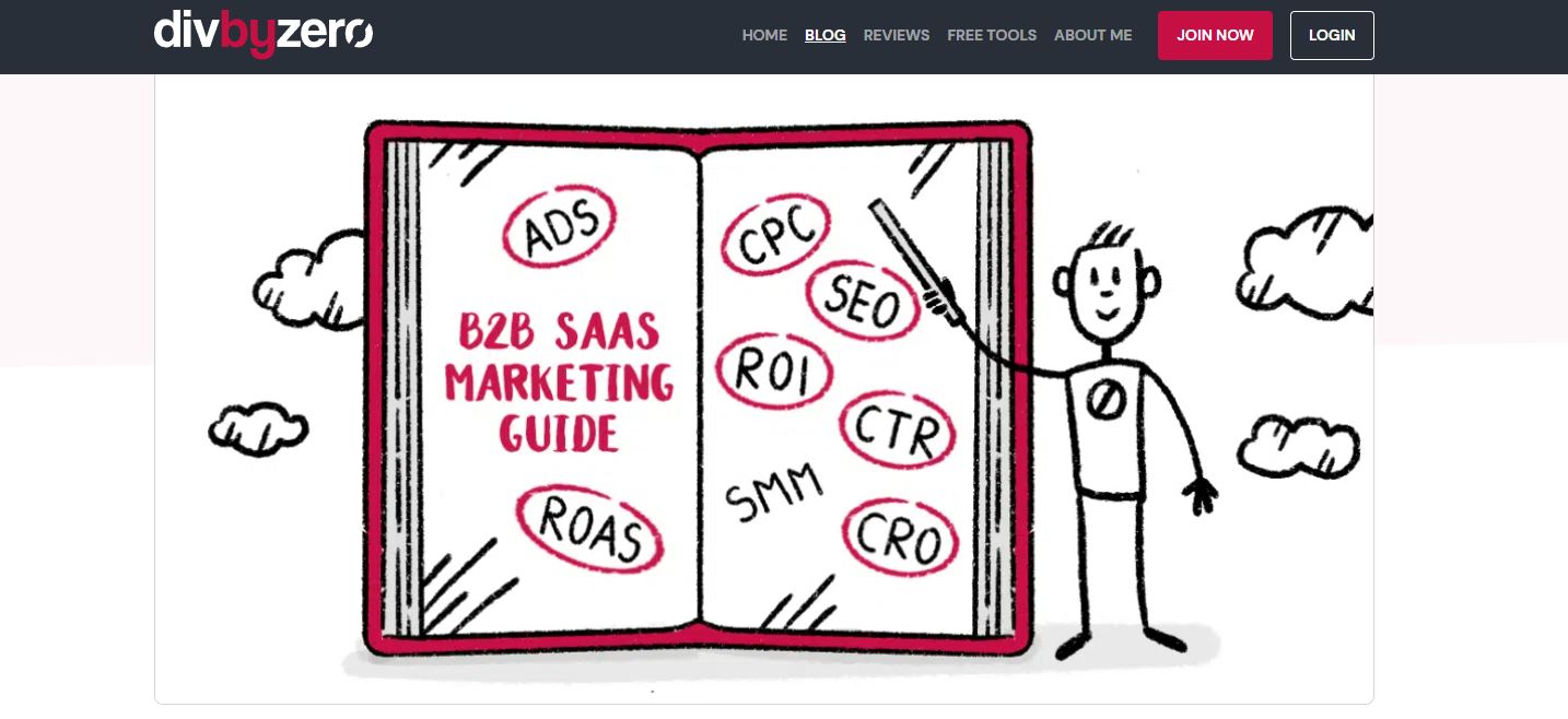
Not only does the custom image differentiate this article from others, but it also helps to further establish a brand image.
In other words, custom images make your content unique and solidify your brand image at the same time.
In the future, we’re anticipating that custom images will supersede stock images on all fronts. We’re expecting they’ll take the place of stock images entirely, not just in feature images.
5. Enhancing palettes with the color of the year: Peri Purple
Hopping on color trends is another popular option in 2022, and what better way to take advantage of this trend than to implement the color of the year into your photos and design?
Color is a top pillar of great design, and the new Pantone color of the year, Peri Purple, is expected to be a hit. Previous color trends that have made their mark include Millennial Pink and Gen-Z Green.
Here’s what Peri Purple looks like:
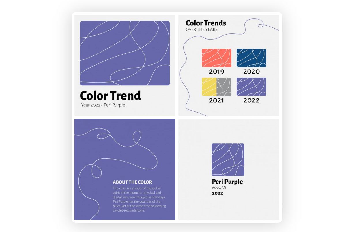
Peri Purple is meant to symbolize the global spirit of the moment — where physical and digital lives are merging in new ways. In a pandemic world, Peri Purple is just the color we need.
Peri Purple has blue qualities and violet-red undertones, so if blues, reds, oranges, purples, and/or yellows are in your brand colors, you’ll love this trend.
You can also play with variations of Peri Purple in case the exact tone isn’t a good match for your brand.
Take a look at some of the other variations below:
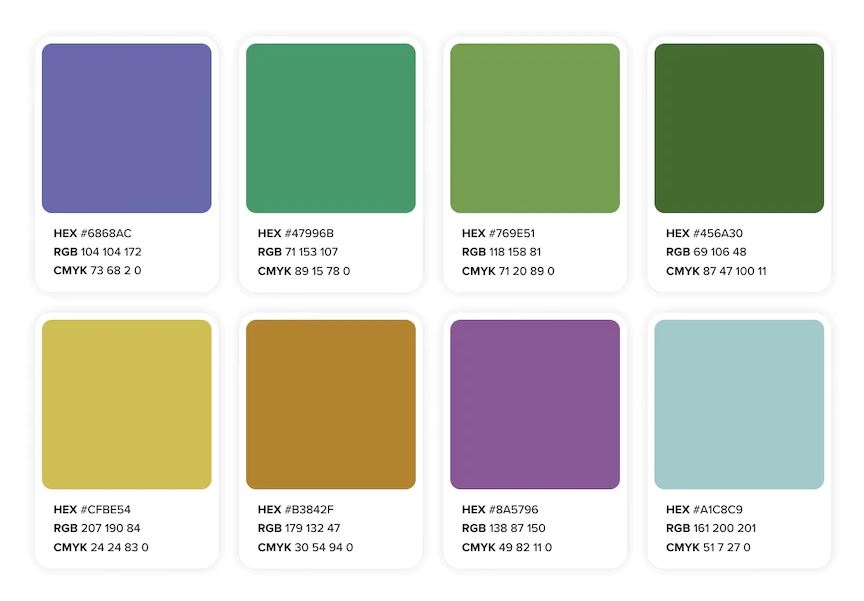
While tons of brands are taking advantage of this color trend, we especially like the way this travel nursing companies brand is doing it:

In this example, you’ll notice the brand features a banner at the top of the page with a background that includes several variations of Peri Purple.
This is a fun way to play with color without overwhelming your audience since all hues in the spectrum are soft and natural.
Here are some ways you can infuse the color of the year into your graphics and visuals:
- Integrate Peri Purple in your email backgrounds
- Add a variation of Peri Purple to your website banners
- Use Peri Purple as a background color in your infographic templates
- Use a variation of Peri Purple as a background in your photoshoots
- Add Peri Purple to your brand palette for the year — switch it out for the new color of the year when it changes
- Snap a photo of all of your products that include Peri Purple or variations of it — use the image in your product photography marketing plan
How to choose the right photo and design trends to capitalize on in 2022
The trends we covered in this article don’t even scratch the surface of what’s popular right now.
In fact, if you’re looking for even more trends, you’ll love our article called 14 Latest Photography Trends You Should Not Miss Out in 2022.
But the problem with so many trends is it can be confusing to know which to try out.
In this section, we’re taking the guesswork out and sharing six easy steps to decide which trends to capitalize on, first.
Here’s what you need to do:
1. Consider your priorities
Why do you want to integrate trends into your design and photography? Are you feeling stuck? Are you looking to improve your current aesthetics? In this step, get laser clear on your priorities.
2. Choose specific, actionable goals
What do you hope to gain by integrating trends into your design and photography work — and how will you know that you’ve succeeded?
For instance, do you want to gain more visibility? Are you hoping to encourage virality? Do you want to be more inclusive?
Jot down specific, actionable goals.
3. Analyze current photography and design trends
Read through your favorite photography and design blogs (cough, cough …) to spot the latest trends. Write down a list of the top ten trends you think will help you reach your goals.
4. Pick your trends
Study the trends a bit more and reduce your list to three to five trends, for simplicity’s sake.
5. Test your trends
Implement your new trends and set metrics to see what’s working and what’s not. Ask your audience for feedback for a deeper insight into what they’re thinking.
6. Pivot and drop trend if necessary
Analyze which trends are helping you reach your goals and which ones aren’t. Pivot when needed and drop any trends that aren’t helping you get closer to your goals.
Wrap Up
Trends happen for a reason. They’re like guides — here to steer us in the right direction and teach us something new.
Staying ahead of photo and design trends means creating visuals your audience cares most about — and growing your reach in the process.
In today’s article, we peeled back the curtain on photo and design trends. We shared the importance of taking advantage of trends and gave you five examples to reference. We also shared how to choose the right trends to capitalize on in 2022.
Here’s a quick refresher of the photo and design trends we covered today:
- Using imagery to support diversity and inclusion movements
- Making information more digestible with descriptive icons
- Optimizing email marketing campaigns with responsive templates
- Personalizing blog content with custom featured images
- Enhancing palettes with the “color of the year”
Looking forward to trying out any of these trends? Have you tried any of them recently? Leave a comment below to let us know what you think.
Looking for a photo editor plus a suite of photo and design tools you can access on the go?
Then you’ll love Colorcinch tools. Head to this page to edit your first photo today. No sign-up required.
About Guest Author: Vikas Kalwani
Vikas is a product-led growth marketer and B2B Marketing Specialist skilled in SEO, Content Marketing, and Social Media Marketing. He manages partnerships at uSERP and is a mentor at 500 Global.


