Want to learn how to create a high-converting product page to maximize conversion rates for your online business?
You’re come to the right spot.
Your product page is one of the most important elements of your ecommerce store. It provides your customers with the information they need to make an informed purchase.
How you display products on your product pages can determine whether you will achieve maximum conversion rates or not.
Why?
Because your prospects need to see the right information before they make the purchase decision. This makes it important to design your product page well.
In this blog post, I’ll share seven design ideas to optimize your product pages to help convert your visitors into buyers.
What’s more?
I’ll also share some product page design examples to inspire you.
Let’s get started.
7 Design Ideas to Optimize Your Product Pages and Drive More Sales
Here are the tactics that you need to implement to design a product page that can drive conversions for you.
1. Optimize Product Pages Design for Mobile Shoppers
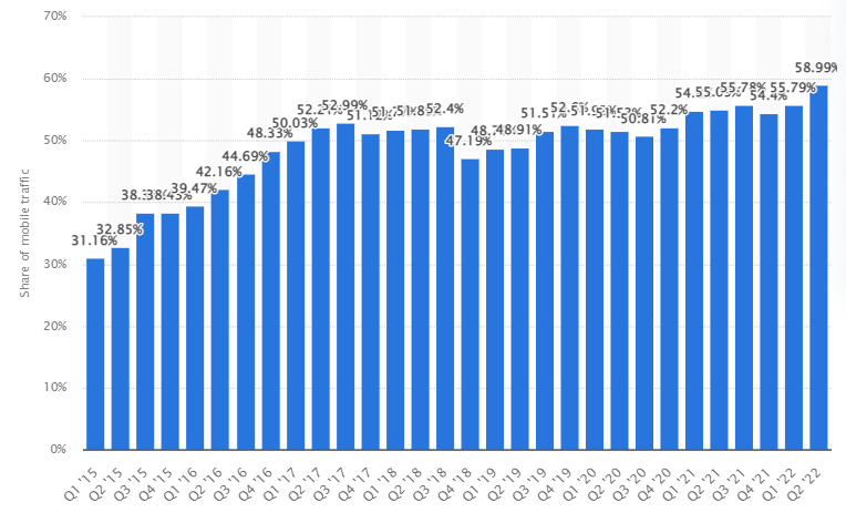
With 58.99% of all internet traffic coming from mobiles, it’s extremely crucial to make sure your product pages are optimized for mobile users.
Firstly, you need to improve your page speed. People shopping with their smartphones might be using mobile data to access your website, so you need to ensure it opens quickly and smoothly.
Secondly, ensure that mobile shoppers can view all the elements and information on your product page. You should also design your product page in a responsive manner for a better browsing experience. This approach is a great way to improve customer experience and boost your conversions.
Also, streamline the checkout process so that customers can complete their purchases fast.
A good idea would be to leverage the best website builder as that would come with responsive designs.
Implement these tips to optimize product pages for mobile users:
- Optimize your images
- Keep your copy short and packed with information
- Make it easy for users to swipe and zoom your product pages
- Keep the “Add to Cart” button visible above the fold.
- Make your breadcrumbs prominent
- A/B test your product pages and use customer feedback
2. Use an Intuitive Product Page Layout
The page layout is one of the most important elements to keep in mind when optimizing product pages for your ecommerce store.
Why?
Because how you design each section can greatly impact how well your pages convert visitors into customers.
An intuitive page layout will help your customers to understand how to navigate around your ecommerce store even if they aren’t familiar with the language used.
As a rule, your page layout shouldn’t be flunky and impractical as this can confuse or frustrate customers.
Keep it simple by putting the product image on the left and the description to the right.
Take a look at how Walmart uses intuitive product pages: A beautiful image on the left and product details on the right with a clear Add to Cart button.
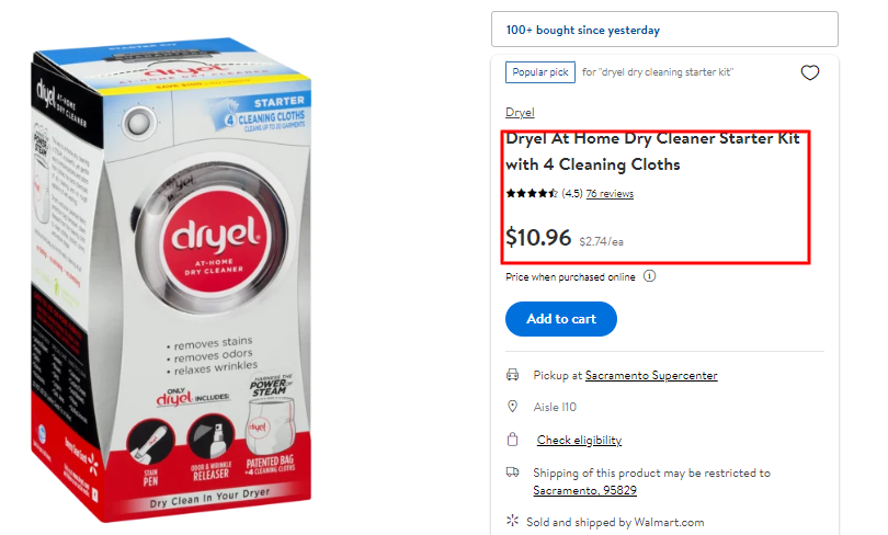
As you can see key information like product pricing, shipping details, etc., is visible and close to the image.
This makes it easier for customers to determine whether the product is right for them without scrolling further.
Moreover, product strategy consultants can integrate effective product page layouts to enhance user experience and increase conversion rates.
3. Include High-Quality Product Photos
One of the practical design ideas to optimize your product page to increase sales is to add catchy and clear images of your products to your pages.
Remember that customers want to get a clear idea of what the product looks like.
The good news is that you can learn some product photography skills online to take high-quality photos of your products using your smartphone.
You can also consider adding 360-degree images to give a more realistic look of the product.
Additionally, you can consider having a product image zoom feature that allows customers to get a good view of the product image.
This way, they will get to understand the product’s finer details.
Another awesome way to display product images is to have a plain white or black background to make the product stand out. You can even use transparent backgrounds.
Take a look at how OnePlus, a Chinese consumer electronics manufacturer, uses images of products to make their product pages visually appealing.

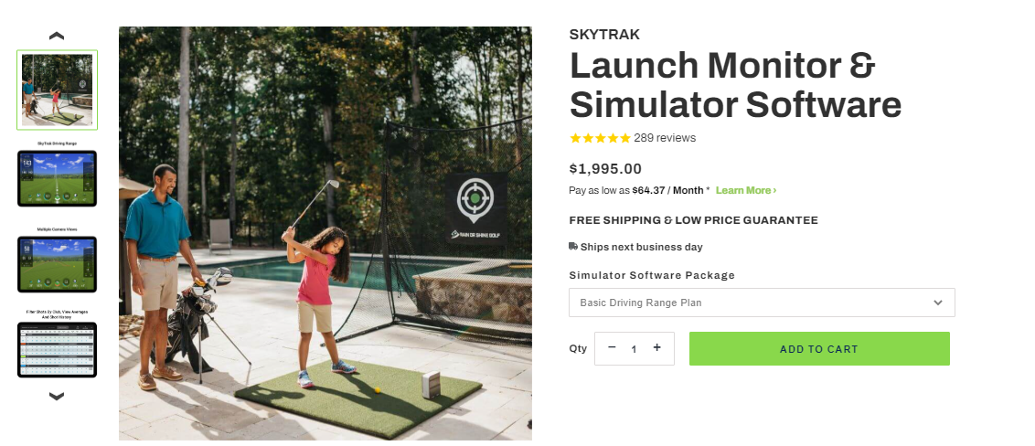
You can take your product page optimization game a notch higher by showing products from different angles in multiple different applications like the way Rain or Shine Golf does it below.
4. Include a Clear CTA Button
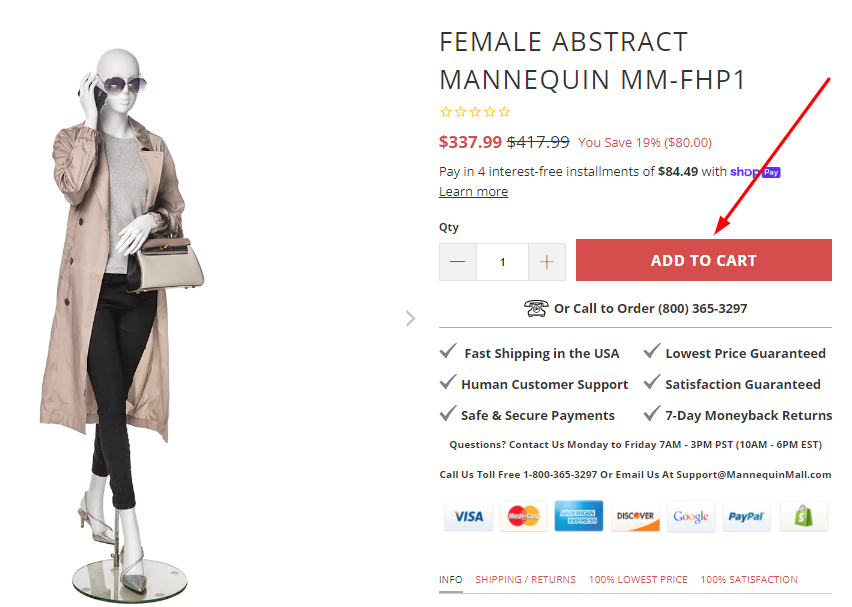
Your product page’s main goal is to get people to hit the “Add to Cart”, “Order Now”, and “Buy” buttons or take the next step you want them to.
This makes the call-to-action button the most vital element of an ecommerce store, making it critical that you design it in a manner that it’s visible and compelling.
Take a look at how Mannequin, a renowned retailer of mannequins uses a visible and strategically placed call-to-action button on their product pages:
Here are practical tips to boost your call-to-action click-through rate:
- Place the button above the fold
- Include your CTA button at strategic places
- Keep the text inside the CTA short
- Use action words
- Experiment with colors
- Use contrasting colors with the background
- Use white space
- A/B test your call-to-action
5. Use Product Videos
Videos are not only engaging but can convey a lot more than any other content format. In fact, they are a great form of contactless marketing.
It’s not a surprise that in a study, 86% of businesses stated that they use video as a marketing tool. You may use an online video editor with an inbuilt video trimmer for a versatile and indispensable asset that can significantly boost your marketing efforts.
Besides, 81% of marketers say video has helped them increase sales.
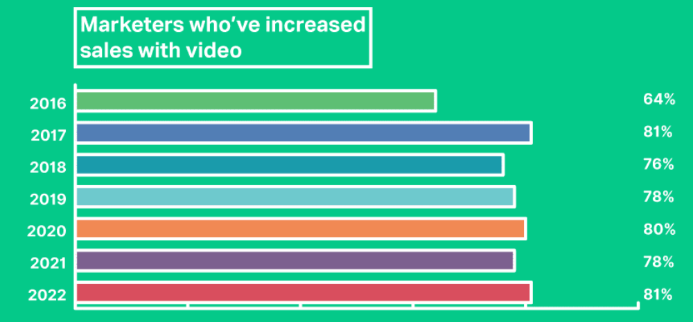
In the same study, 88% of consumers said that they have been convinced to buy a product or service by watching a brand’s video.
Due to their entertaining and engaging nature, using videos on product pages can help boost the conversion rate of your ecommerce store and increase your online sales.
You can add videos to your product image carousel so your visitors can choose to watch them if they want. Similarly, you can provide your reviewers with the ability to upload videos.
This can help you show even more authentic videos on your product page, which can make an impact on your visitors.
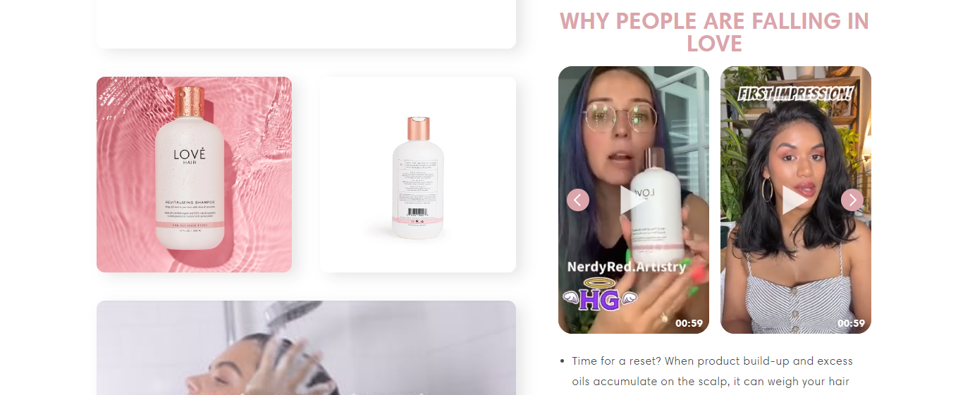
Take a look at how Love Hair shows their customers how to use their Revitalizing Shampoo and Conditioner in this short video on their product page. They’ve also featured videos of their customers.
- Demonstrate product capabilities
- Create instructional videos
- Keep your videos short and simple with a video editor
- Add value
- Show users exactly what they need to know about how your products work
6. Optimize Your Product Page Load Time
Given how impatient users are today, page load speed should be at the top of your mind when creating and optimizing your product pages. Leveraging the best ecommerce platforms can help you create optimized pages for your products.
Adding features such as a Shopify popup can further engage visitors by highlighting promotions or capturing emails without compromising page speed.
Fast load times not only enhance user experience but Google uses page load speed and mobile friendliness as a ranking parameter.
Here is how to optimize page load time:
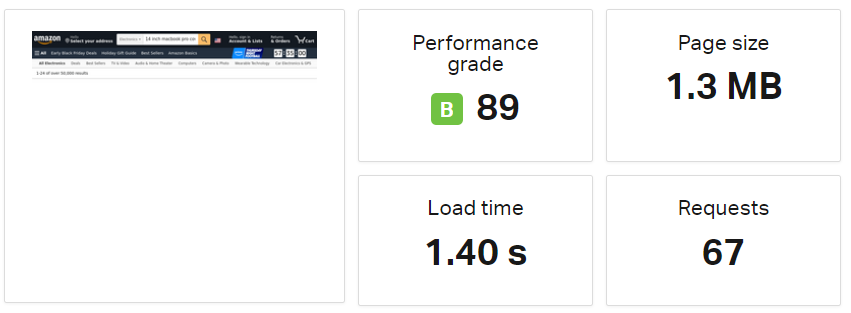
- Measure page load time with a tool like Pingdom.
- Optimize image size and format
- Avoid inline JS and CSS files
- Compress your images and videos
- Lazy load your images
- Optimize caching
- Avoid redirects
- Use a content delivery network (CDN)
- Minify your HTML or CSS
7. Include Social Proof
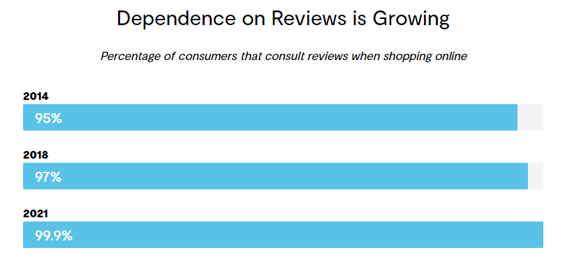
Did you know that 99.9% of consumers read reviews when shopping online?
And that’s not all.
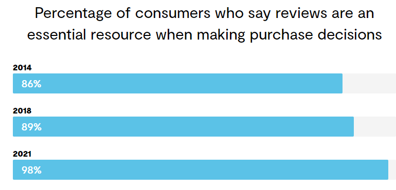
98% of online customers say reviews are an essential resource when making a purchase decision.
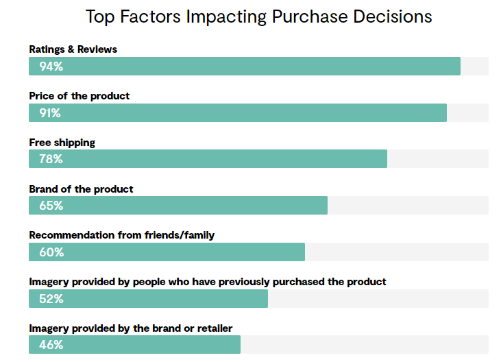
In fact, ratings and reviews are among the top factors impacting purchase decisions.
What does this mean for brands?
This makes displaying product ratings and reviews one of the most powerful design ideas to optimize your product pages to boost conversion rates.
There are three options to display social proof on your product pages:
Ask Your Customers for Reviews
Satisfied customers will be happy to leave positive reviews on your products even if you don’t ask them to. For those who don’t, here are best practices to ask for reviews without annoying them:
- Send them a quick SMS
- Include a review template for your customers on your website
- Send an email
- Send a handwritten note
- Use incentives to get online reviews
- Ask for reviews via social media
- Ask for reviews on your Thank You page
You can create customer journey maps using professional templates to visualize the entire customer experience from start to finish, identify pain points, and optimize interactions.
Include User-Generated Content
User-Generated content(UGC) delivers an overall conversion rate of 3.4%.
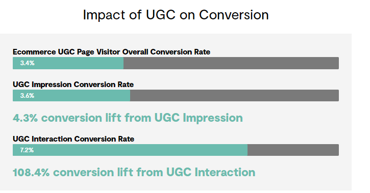
User-generated content is simply content submitted by your happy customers. You can take permission from customers on social media and use their content as reviews on your product pages. All you need to do is embed the videos or images on your product page and you’re good to go.
Display Real-Time Sale Notifications
If your ecommerce store is still new and you don’t have enough social proof on your product pages to show, displaying real-time sale notifications can be a great idea.
When you show real-time sale notifications, it shows prospective customers that your store is busy and thriving.
Besides, it’s a great way to show others that real people are buying from your store.
Get Hyped Media is a good example of a brand that uses this strategy:
Final Thoughts
Driving traffic to your online business is half the battle. You also need to ensure every customer that lands on your product pages converts into a buyer.
By optimizing your product pages effectively, you increase the chances of boosting conversions on your website.
Use these seven practical design ideas to optimize your product pages to drive greater conversions and generate more revenue for your business.
About Guest Author: Gaurav Sharma
Gaurav is the founder and CEO of Attrock, a results-driven digital marketing company. Grew an agency from 5-figure to 7-figure revenue in just two years | 10X leads | 2.8X conversions | 300K organic monthly traffic. He also contributes to top publications like HuffPost, Adweek, Business 2 Community, TechCrunch, and more.
