
A wise man once said, “don’t judge a book by its cover,” but the truth is that people DO judge a book by its cover.
Similarly, a blog logo is like a book cover. It is the first thing your visitors notice about your blog.
It’s also a visual representation of your brand identity, values, and vision. Just think about Nike, Apple, McDonald’s, etc., logos.
These logos are instantly recognizable, and each carries specific connotations in our minds. When you see one of these logos, you immediately think about who they are as a brand and what they sell.
That’s the power of having a good logo.
So, if you’re going to start a professional blog, you need to design a logo that stands out from the crowd.
The good news is that creating an iconic logo doesn’t have to be expensive or complicated. It can be pretty straightforward if you know what tools to use.
In this post, we’ll walk you through the step-by-step process of designing a blog logo. As a bonus, we will list some of the best free logo designing tools.
But first.
Why Do You Need a Logo for Your Blog?
A logo is one of the first ways your target audience becomes familiar with your blog and brand. It tells who you are and what they can learn from reading your blog. But, without a logo, readers may not be able to identify your blog again quickly.
Furthermore, when people see a professionally designed logo for a company or blog, they’re more likely to believe that the company is reputable and trustworthy. This can lead to increased sales and help your business grow.
In short, a blog logo is crucial for:
- Grabbing users’ attention
- It builds brand recognition and identity
- It builds trust
- Show off your professionalism
- Help you marketing
Now you know the benefits of having a blog logo, let’s see what type of logo you should create.
What Type of Blog Logo Should You Design?
Blogs are not just for individuals. A blog can be a hobby, a company, or even a brand blog. As with any business, you want to stand out from the competition, and one way to do that is with a great logo.
The purpose of your logo will depend on the type of blog you have, but in general, it should reflect your professionalism and represent your brand.
There are several types of logos used by blogs. Some people prefer text-based, some logo-based, and some graphical logos. And while there are many different types of image formats to use, some stand out better than others.
To create your blog’s logo, consider using one of the following designs.
1. Wordmark Logo
A text-based or Wordmark logo is a simple design that includes only the name of your blog. This type of logo is often used by established brands that are recognizable without the need for any graphical elements.
Wordmark logos are often used by companies and brands like Coca-Cola, Google, Microsoft, etc.
To create a Wordmark logo, you can select any font and color for each letter. You can also choose different font sizes, spacing, and formatting text.
If you have a shorter name, you can place two words together or stack them one on top of another. In the end, the goal is to find something that looks great and represents your brand well.
2. Pictorial Mark Logo
A graphic-based or pictorial mark logo is a type of logo that uses graphics or illustrations that represents the brand’s values, ethics, and ideals.
Some graphic logos use just one image; others might use multiple images to represent the company.
These logos are ideal for businesses who want to communicate an abstract concept through their logo design. For example, Nike’s swoosh is the company’s graphic-based logo, but the text “Nike” isn’t included.
Graphic-based logos are usually simpler than typographic logos, and they are primarily used as representations of blogs that have established themselves as brands.
3. Combination of Both
This type of logo is a combination of both graphics and text. In other words, it contains a graphic image (called a logomark) and the company’s name written in text. Some great examples of such logos are Disney, Dell, Pizzahut, etc.

The following seven-step process will guide you in creating a beautiful logo that will look great on your blog.
7 Steps for Designing a Blog Logo
1. Think About Your Audience
The first and most crucial step in designing a blog logo is to think about your audience. The more specific you can be about your target audience, the better.
To get a clearer picture of your audience, ask yourself:
- Who am I writing for?
- Are you targeting millennials or baby boomers?
- Writing for women or men?
- Are they young or older?
- How will my brand change over time?
These are just a few questions to ask before you start designing your blog logo, which will help identify the best color scheme, typography, and design elements for your brand.
For example, if you design a logo for an older audience, consider avoiding trendy typefaces in favor of something more traditional.
And if you have multiple audiences in mind, consider creating more than one version of your blog logo, so it appeals to each one.
2. Use Design Sites for Inspiration
Unless you are a professional logo designer, your first attempts at creating a logo are unlikely to impress your audience. The best way to avoid this is to look at great logos for ideas.
When looking for inspiration, don’t just look at other blogs in your niche.
Instead, look around at logos from big brands in any industry and see if you can find any elements you like. The more variety, the better! You never know what might spark an idea or help you find the right combination of colors or fonts.
Get inspiration from a marketplace such as Creative Market, which offers millions of graphics, icons, stock photography, and pre-made logo designs.
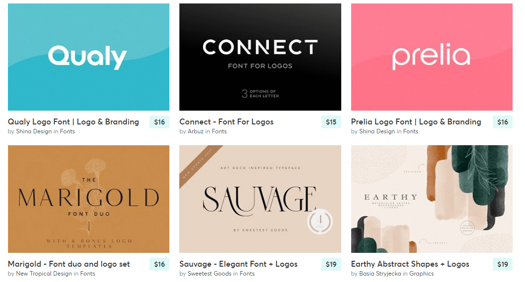
Explore the site for ideas or buy any interesting assets. By looking at all the different items available on the site, you can better understand what logos you can create.
3. Choose a Color Palette that Reflects Your Website
Every blog has a color scheme that makes it unique — whether you’ve chosen one or not.
Before you start designing your logo, you want to ensure that the colors you choose work with your brand and overall blog aesthetic.
If your website has a crisp, clean look, you want to select colors that reflect that style choice. If you have a more artistic, bohemian feel to your site design, you’ll need to pick colors that evoke that mood.
As you start brainstorming your blog logo ideas, it’s best to choose 3-5 color palettes that match the overall look of your website.
One of the best ways to create a color palette is with Adobe Color.
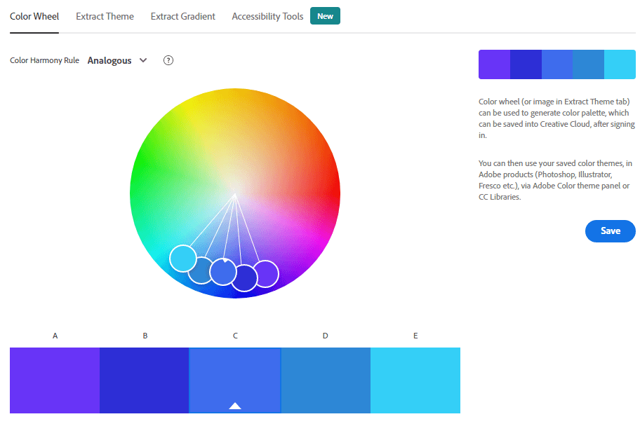
This free tool allows you to browse through thousands of color palettes created by other designers.
You can also create your own using the color wheel and even adjust your chosen colors until you find the perfect combination for your brand.
4. Pick the Right Font
After picking a color palette, choosing a font for your blog logo design is next. There are a lot of fonts out there, and it can be overwhelming to pick the perfect one. So, here are some valuable tips for choosing fonts.
First, start picking two fonts max. The best blog logos use one or two fonts, and some use just one.
Secondly, avoid using too many fonts; this can make your logo look messy and difficult to read. Instead, use a clean font that’s easy to read. This will ensure your logo looks great on smaller devices like mobile and tablets.
In addition, the font you choose should fit with the tone of your site; for example, if your site is fun and casual, then a stylish script font might be a good choice, but if it’s more formal, then a serif or sans-serif font would be better.
Luckily, there are some online tools like BrandCrowd help you design thousands of text logos in just seconds.
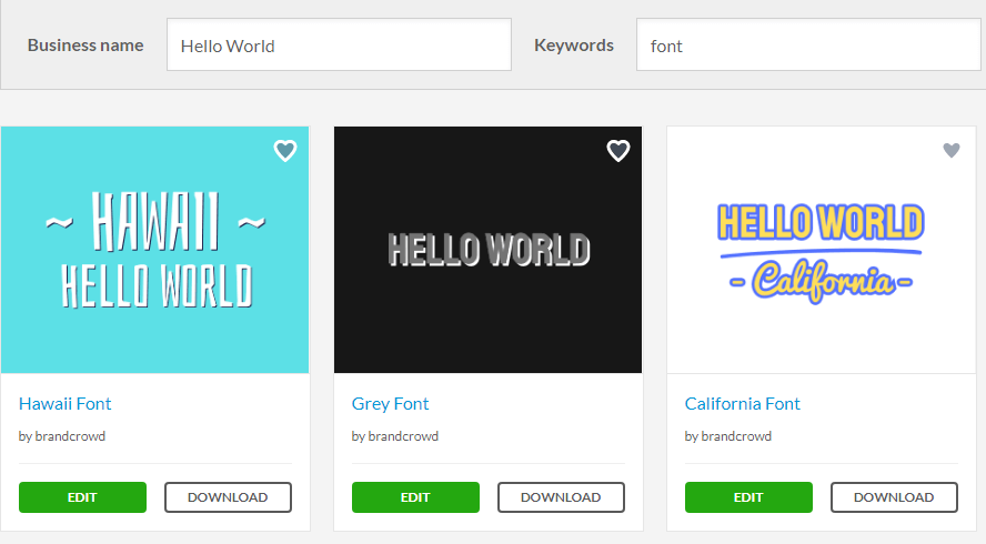
Enter your blog name and click on the search button to get started. Within seconds, you will have dozens of attractive logo options. You can use these logos or edit them freely to suit your purposes.
5. Make a Few Versions
Sometimes a single logo isn’t enough. There are times when you need to use it in different situations and colors.
A good example is a website’s favicon, which is the icon that appears on your browser tab. It might be small and light on detail, but it needs to be recognizable as your logo, right?
Making multiple variations of your logo will help you make sure it looks good everywhere they are used.
So, when designing your logo, it is essential to create at least three variations. You can use the same core design and only tweak the colors or size to make these variations.
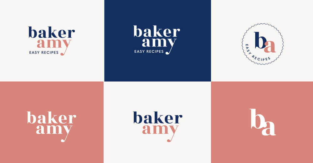
For example, if your first version uses a complex font and has an illustration, your second version could use a simpler font and focus on the illustration.
6. Create Your Logo Using a Logo Designer Tool
If you are not familiar with design principles or don’t have enough budget to hire any designers, you can still design your blog logo with the help of free online design tools. Remember that the cost of logo design doesn’t determine if it is the best logo for you or not. You can absolutely design your own logo or have a professional logo designer do it for you.
There are several logo designing platforms available, and we recommend using Colorcinch.
Colorcinch is an online free logo maker tool that allows you to create your unique logo in just a few clicks. The process is straightforward and intuitive, even for people with no graphics skills.
You can use the default image or upload your photo from Facebook or your computer. You can also change the logo’s color, add a picture, add text, and more.
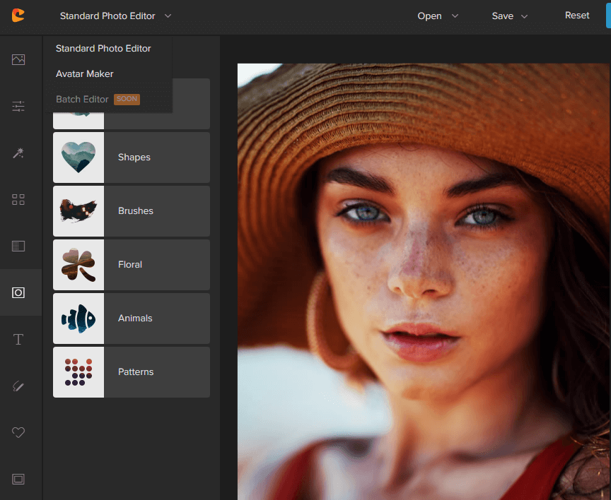
Colorcinch is free to use. However, the free version of the tool comes with several limitations. If you want access to all the premium features and graphic collections, you need to upgrade to the premium version, costing you only $3.99 per month.
7. Upload the Logo to Your Blog
Once your logo is ready, it’s time to upload it to your website as a transparent PNG file. This will ensure it looks great on all backgrounds.
1. Uploading logo to your WordPress site
If you are using WordPress CMS, follow these steps.
Step 1. Log in to your WordPress admin panel.
Step 2. Go to Appearance > Customize > Site Identity.
Step 3. Under the Site Title and Tagline, you can see the Site Icon option.
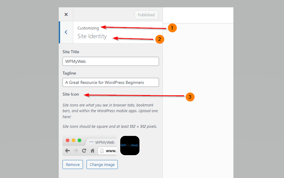 From there, upload your logo and hit the Publish button.
2. Uploading logo to your Wix site
Step 1. Go to the Settings tab and click on the Business Info.
Step 2. Click on the Add Logo option under Your Profile section.
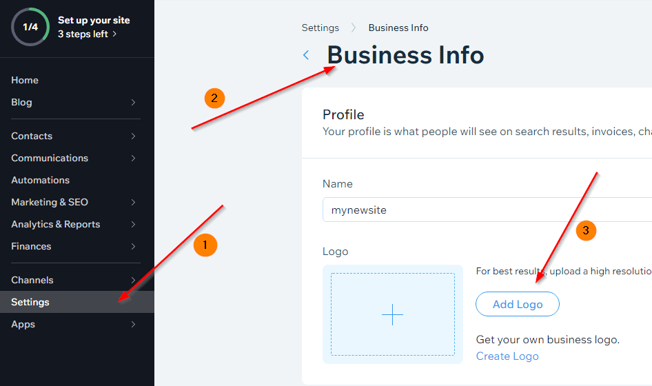
Step 3. Upload your logo and then Save it.
3. Uploading logo to your Squarespace site
To upload a logo to your Squarespace site, follow these steps.
Step 1. Click on Edit of your site preview.
Step 2. Hover over the header and click Edit Site Header.
Step 3. Click Site Title & Logo.
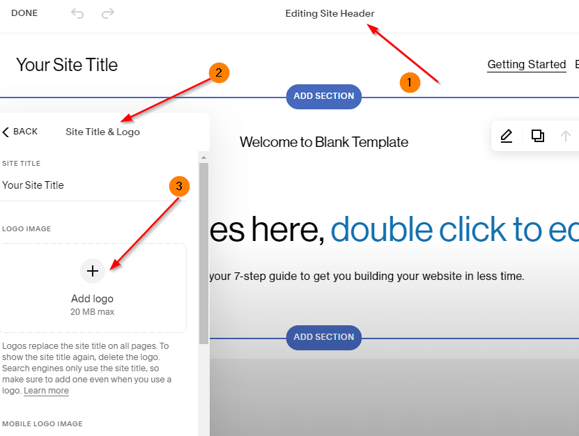
Step 4. Then Upload Your Logo and click Save.
That’s it! Now, you have successfully uploaded a logo to your website.
You can also check what your logo looks like by opening it on another browser.
Wrapping Up
Now that you are familiar with creating a logo, it’s time to apply your knowledge and make it yourself.
Before you begin designing a logo, you need to determine what kind of logo you want to create; there are many different kinds of logos, and each one needs a slightly different approach.
Reflecting on your business, making an initial sketch, and researching the logo design process will be much easier.
I hope you found this little guide on “how to design a blog logo” helpful and informative. Hop on and try our powerful image editing tool for free.
About Guest Author: Jyoti Ray
Jyoti is the founder of WPMyWeb.com, which specializes in social media, marketing, and SEO. He writes and has been featured on JeffBullas, SurveyAnyplace, SearchEngineWatch, and more.


