
The holiday season is the perfect time of year to pull out all the stops to engage customers and drive holiday sales using high-quality visual content.
From eye-catching holiday graphics to festive logos, you can create engaging visuals that capture attention and inspire action.
So get ready to deck the halls with your best visual content yet.
Here are seven ideas to get you started if you’re looking for ways to take your visual content to the next level this holiday season.
Let’s dive in.
1. Use creative typography to add interest and provide context
Typography is an essential aspect of visual content. Creating a focal point with text can turn any ordinary photo into a beautiful masterpiece. It also adds flair without being too overpowering.
Try experimenting with different fonts, font sizes, and text alignment to create contrast, add visual interest, and build a connection with your target audience.
Kohls does an excellent job using fun and engaging typography on their kids’ toys landing page. Alternating the font colors and playing around with the size and spacing of the lettering creates a whimsical vibe, perfect for attracting children’s attention to “The Toy Box.”

The content wouldn’t have the same effect if they used a dull, black, symmetrical font. It’s crucial that whatever typography you choose aligns with both your brand and your target audience.
For example, if you have an edgy and modern brand, it may be best to use a more traditional or classic style for your holiday posts. In other words, choosing a font that’s easy to read and consistent with your brand is critical to the success of your content.
The purpose of typography isn’t just about looking pretty — it’s also about aiding comprehension of your content.
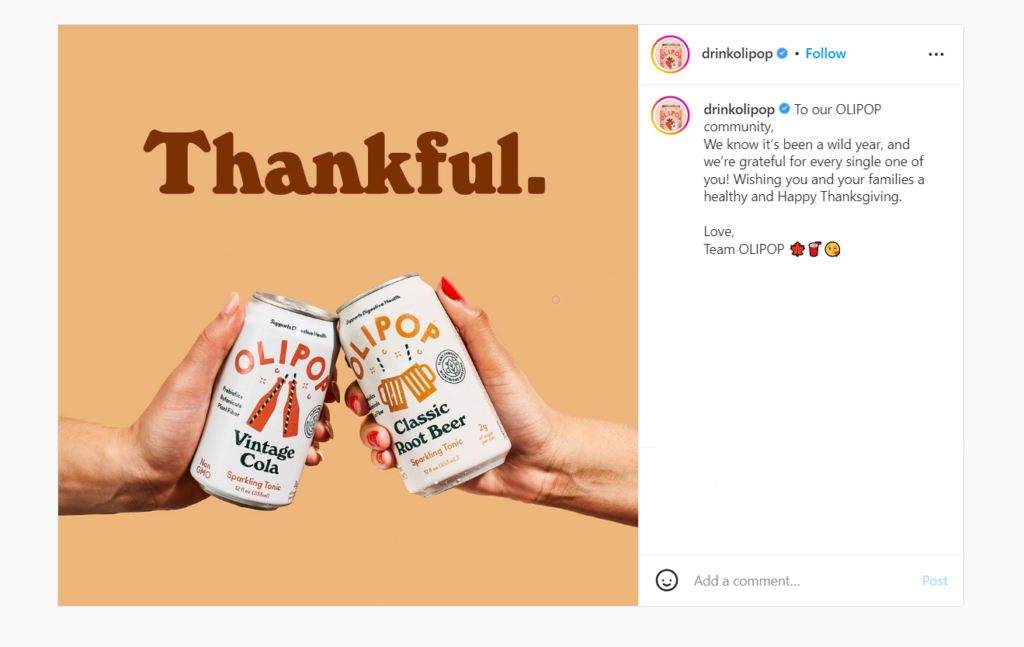
Take Olipop’s Thanksgiving post on Instagram as an example. Without adding the “thankful” text, the photo doesn’t hold much meaning. You’d only see two people performing cheers with their soda cans.
By adding the text at the top of the image (and using the appropriate fall colors), it’s clear that this photo is related to Thanksgiving rather than Valentine’s Day or another celebratory event.
Don’t underestimate the power of typography. It makes more of a difference than you might think.
2. Experiment with color combinations and gradient backgrounds
The holiday season is the perfect time to experiment with color combinations, gradient backgrounds, and complementary and analogous colors.
Gradient backgrounds can add dimension and depth and can also help to create a sense of movement. To create a gradient background, start by choosing two colors. Then, use a photo editing tool to blend the two colors together.
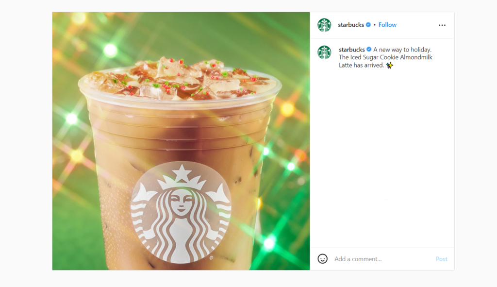
Starbucks is the king of holiday content. This festive Instagram post uses a green gradient background to show off their new holiday drink, the Iced Sugar Cookie Almond Milk Latte.
Choosing the right colors for your visual content is key to capturing your audience’s attention.
Colors can create contrast, add visual interest, and convey emotion.
Keep the color wheel in mind when choosing colors for your holiday visuals:
- Complementary colors (red and green) are opposite each other on the color wheel and can create high levels of contrast.
- Analogous colors (yellow and green) are next to each other on the color wheel and can create more subtlety and harmony.
3. Add festive holiday graphics and icons
Who doesn’t love to see cute snowmen or colorful holiday lights during the winter holiday season?
Adding recognizable holiday graphics to your photos, infographics, flow chart, and other types of visual content is a surefire way to spice up your visual content.
For Christmas, red and green colors are always popular choices with a Christmas tree or garland. For Hanukkah, consider adding blue and white alongside a menorah or dreidel. And for New Year’s, gold and silver can be festive and elegant with a clock or champagne glass for the perfect touch.
You can also use holiday-themed graphics and icons in the background of images, not just as overlays.
Recess, a sparkling water brand, uses a photo editor to turn an ordinary photo of three cans into a winter scene of carolers by adding a snowy background, garland, and winter accessories.
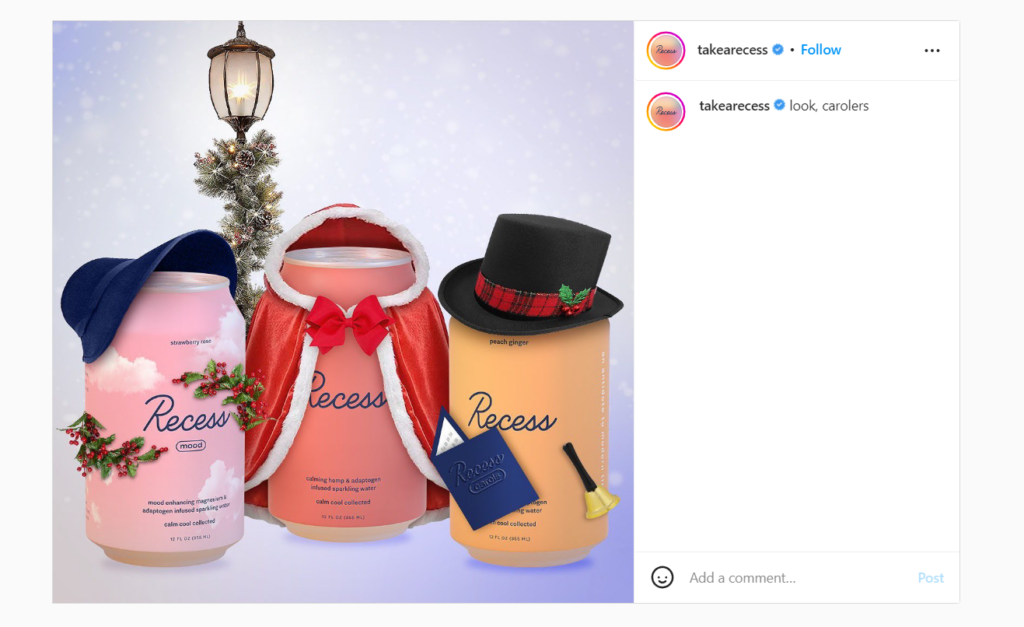
The image with the added stickers and background enhances the appearance and is more likely to catch the eye of fast-scrolling users on social media.
4. Create a festive logo
A holiday logo is a great way to show your holiday spirit and promote your business simultaneously. You can use a free logo maker for this.
When making a different version of your logo, it’s crucial to keep the following things in mind:
First, make sure that the logo is festive and seasonal by using holiday-themed colors, fonts, and images. For instance, you can turn one of the letters in your company name into a Santa hat or snowflake. Another thing you can do is include little icons to add a festive touch without altering your logo too much.
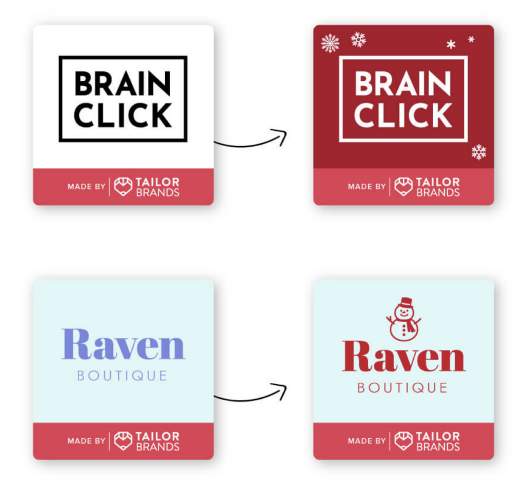
Second, ensure that the logo is easy to read and understand.
Third, consider how you want to use your logo. Will you use it on holiday cards, proposals, your website, or social media platforms? Knowing how you want to use your holiday logo will help you choose the right size and format.
Need some inspiration? Check out these popular brands that went above and beyond to create a new logo during the holiday season:
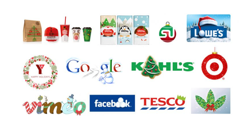
Creating a holiday logo should be a joyful experience. After all, that’s what the holidays are all about! Don’t forget to have fun.
5. Incorporate animated GIFs or videos
Short-form videos are taking over social media by storm.
This medium is highly effective at catching attention and holding interest just long enough for your audience to stick around to see your message.
Plus, GIFs and videos are often more shareable than static images or text-based content, meaning that they have the potential to reach a wider audience.
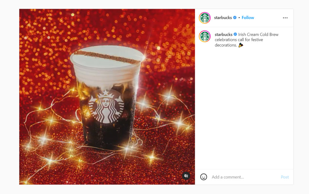
GIFs are particularly well-suited for social media, where they can help to add a touch of fun and personality to your content. It prevents your audience from scrolling right past your image on Instagram, almost like a double-take once they see the animation like this post of an iced cold brew from Starbucks.
The animation in this post shows the cream slowly pouring, taking over the ice, and turning the dark coffee into a lighter, creamy color. It’s mesmerizing against the holiday lights and red background.
On the other hand, videos offer a more immersive experience that can really capture the spirit of the season. This type of holiday content is perfect for influencers and affiliates to share. So if you are wondering when or how to start an affiliate program, the holiday season can ease you into this type of marketing channel.
So if you’re looking to add a little extra pizazz to your holiday content, consider using animated GIFs or videos to help your holiday content stand out from the rest. Additionally, make sure to use social media analytics tools to track the performance of your holiday content and gain insights into what’s resonating with your audience.
6. Use white space to your advantage for a cleaner look
White space is essential to good graphic design and creating a clean and modern look.
Too much white space can make a design look unfinished, while too little can make it feel cluttered and busy. The key is to find the right balance for your visual content.
Rolex hits the nail on the head with this Instagram post featuring their new mint green dial ahead of the holiday season. Immediately your eye is drawn to the watch, with plenty of white space surrounding the product.
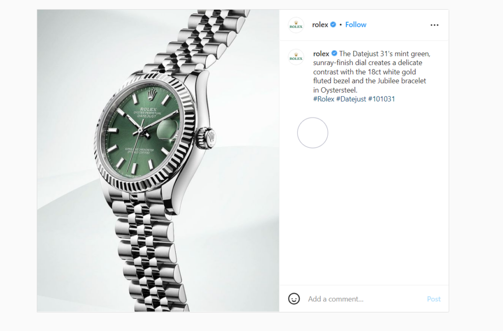
In general, white space should make up about one-fifth of the total space in a design. And lead the eye toward the subject, not away from it. Try placing the subject off-center or using an asymmetrical layout.
By carefully considering the placement within the frame and using white space to your advantage, you can produce beautiful and eye-catching designs to encourage your audience to make a purchase.
7. Use cartoons to your advantage
What do the Harley Quinn Fortnite character and Spongbob have in common?
They’re extremely popular with tweens, generate millions of dollars annually, and are cartoon characters.
So why not follow this popular trend and add some cartoon elements to your visual content this holiday season?
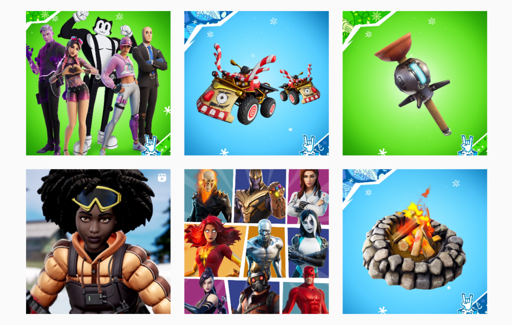
Take a peek at how bright and engaging the Instagram page looks for Fortnite. Looking away is hard, and you instantly want to learn more.
And if you are looking to add some personalization to your website, consider using a photo cartoonizer to turn headshots into fun images on your “about us” page.
Incorporating cartoons into your visual content can help make your brand more fun, relatable, and recognizable.

Everyone loves cartoon characters, so try them out in your next social media post or email marketing campaign. For every dollar spent, email marketing typically yields a return of $36. Simply, you get 36 times your investment of one dollar. According to reports, targeted emails and emails delivered to segmented lists account for 36% of the email marketing ROI for all email campaigns. A verified email list can even increase ROI more than this.
Step up your visual content this holiday season
The holiday season is one of the busiest times of the year.
You don’t have much time to capture your audience’s attention, so make it count by sprucing up your visual content with creative typography, festive holiday graphics, and colorful backgrounds.
If you want to take it up a notch, try creating a holiday version of your logo or a cartoon character.
Use your visual content to increase customer engagement and boost sales this holiday season.
Happy designing!


